THE BRIEF
The project was born from a desire to create a "golf course bible" and a clothing line that is versatile, high-quality, and affordable. The primary objective was to develop a brand that celebrates the game from the perspective of the regular 9-to-5 golfer, moving away from elite, pro-focused systems.
The Problem: A gap in the market existed between stylish, high-quality apparel and accessible pricing, with most golf gear being single-purpose and overly expensive.
The Solution: A brand identity that transitions seamlessly from the office to the course and the weekend, grounded in authentic, activity-specific communities.
Core Values: Performance, Comfort, Style, Aussie Roots, Sun Protection, and Sustainability.
THE LOGO SYSTEM
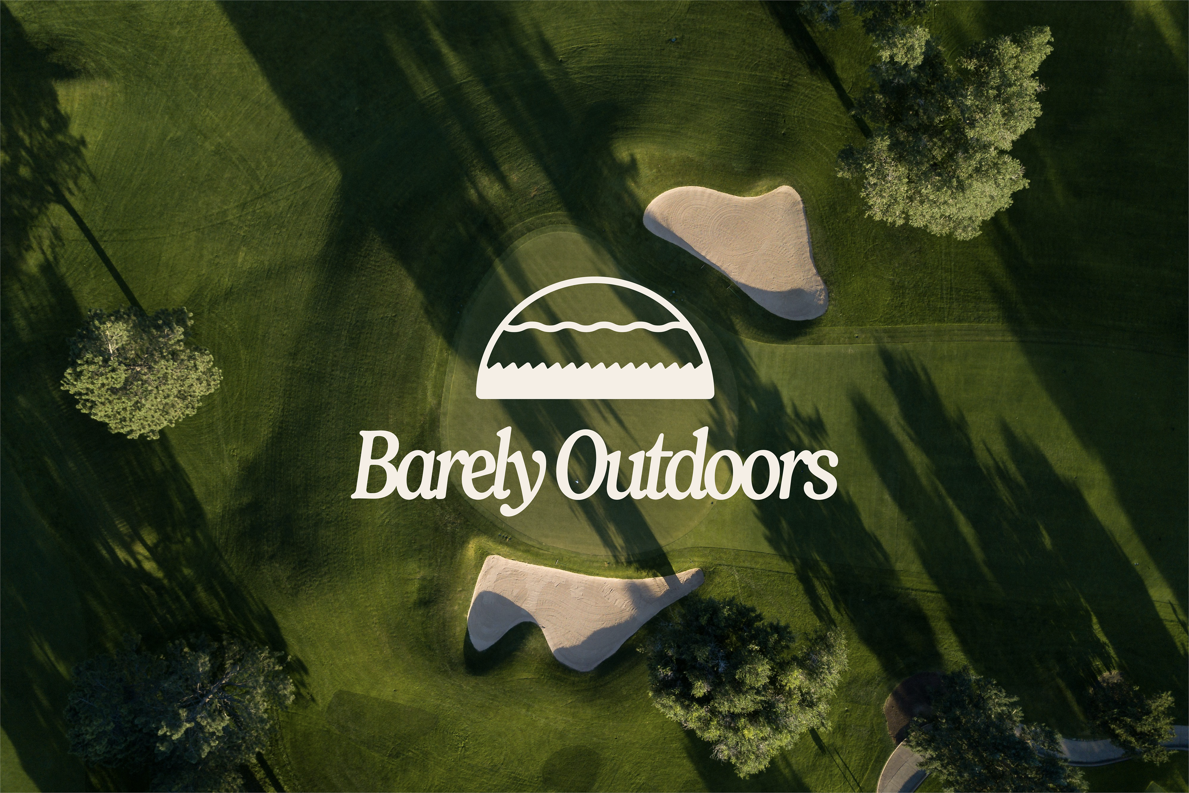
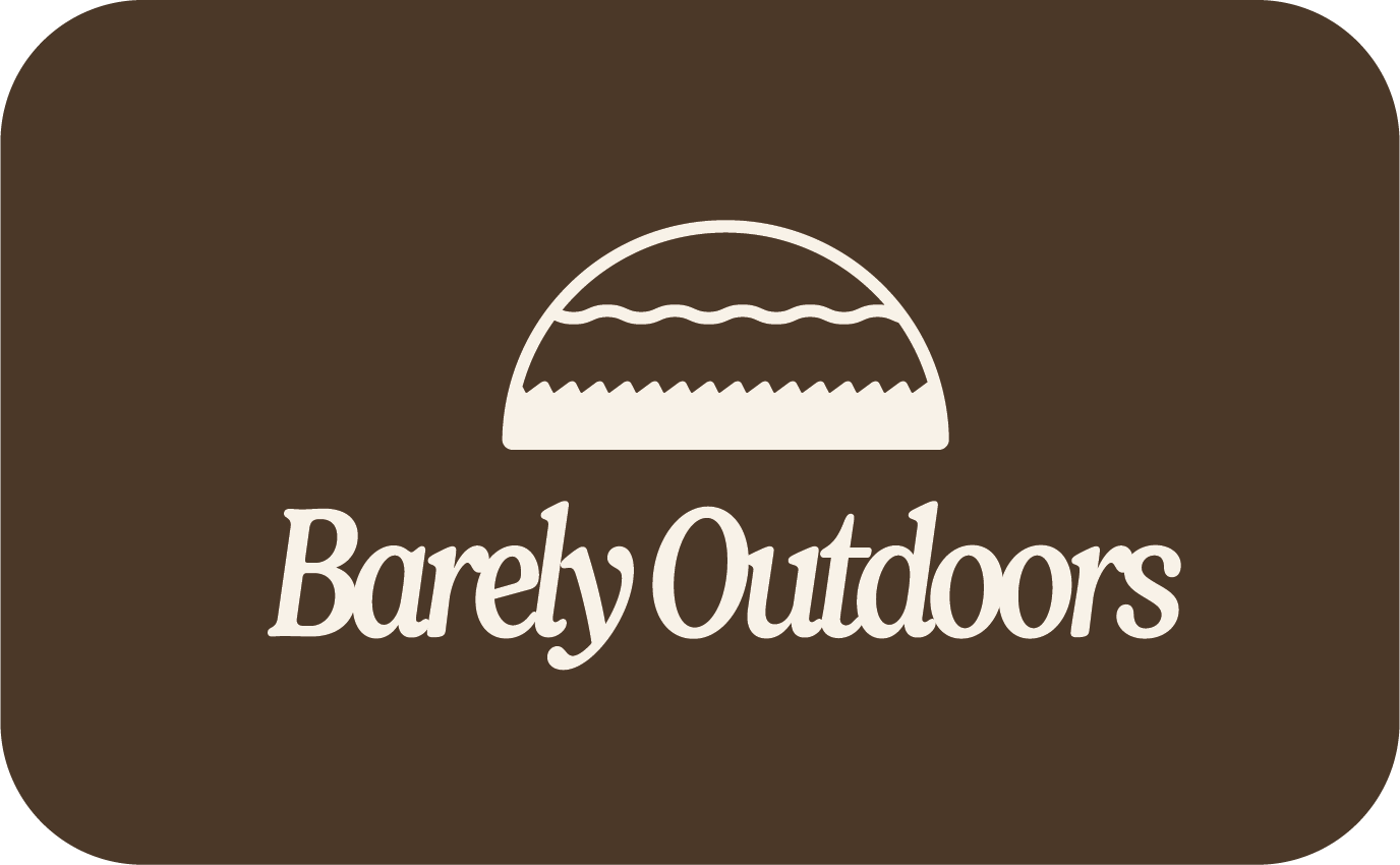
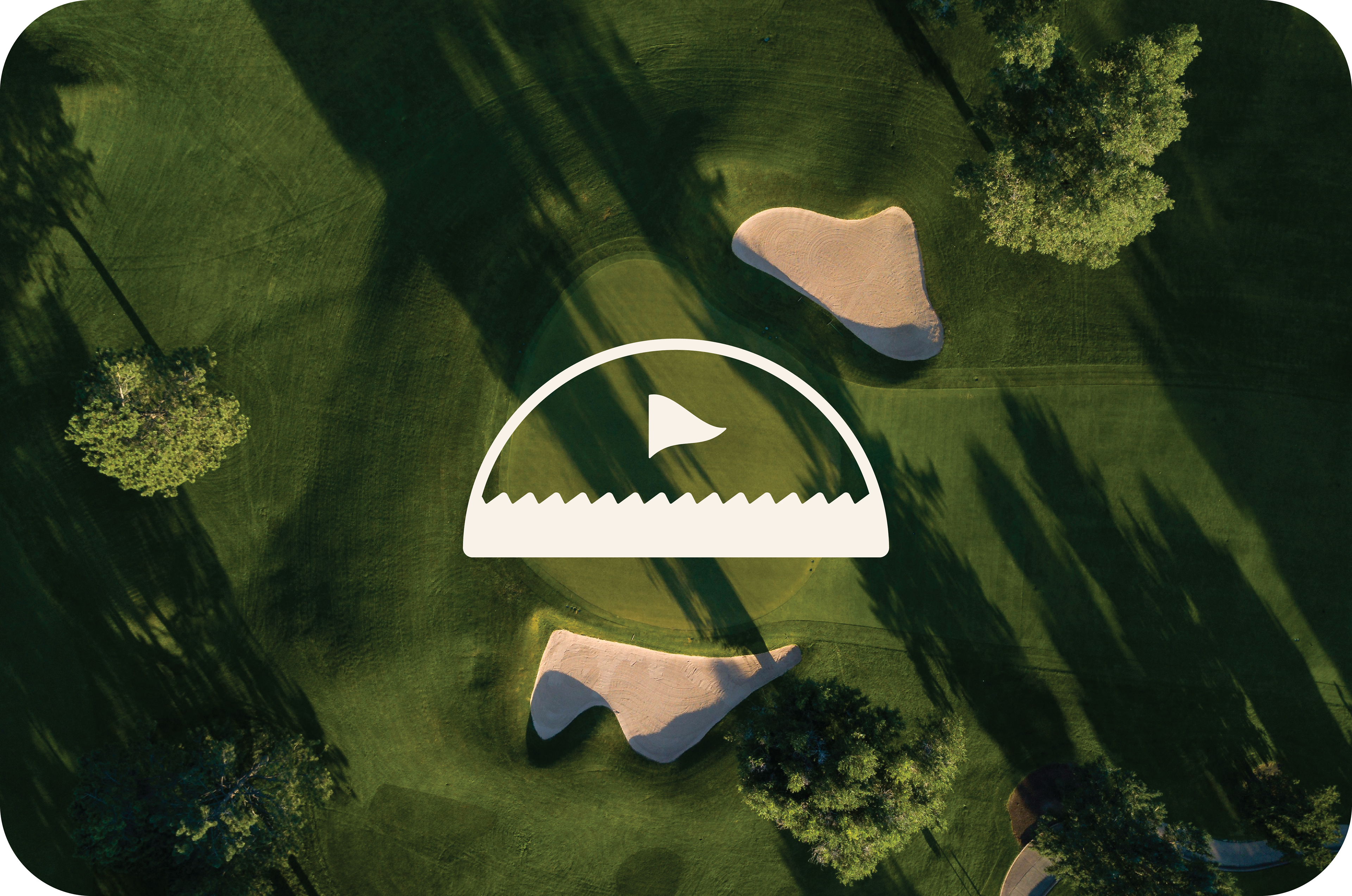
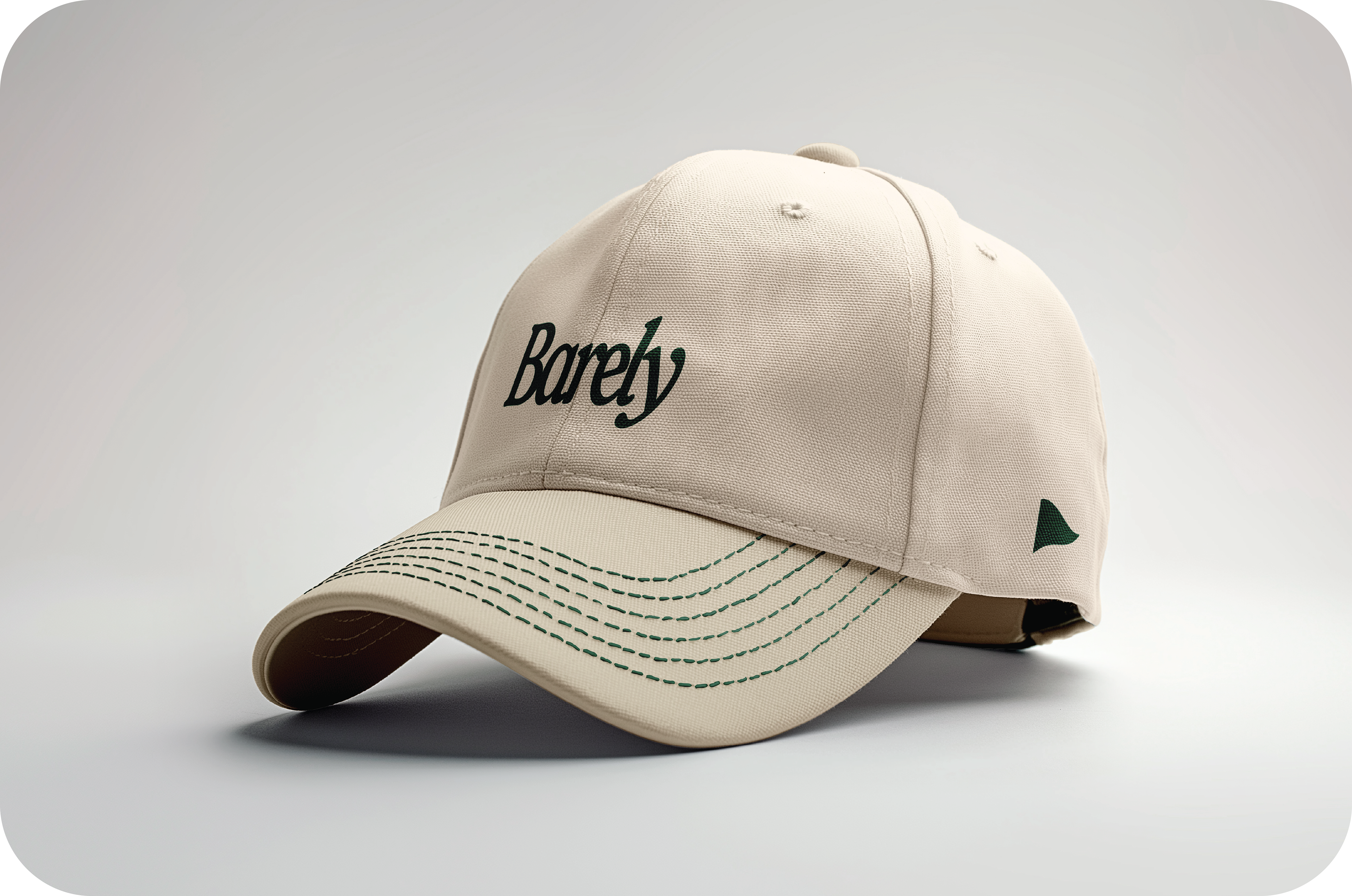
The logo system was designed to be simple, memorable, and flexible enough to house 'Barely Tee'd Up" and future lifestyle ventures like "Barely Hooked". After a few iterations I created a retro style icon encompassing the different outdoor sport terrains of grass and water. The design also creates a friendly laid-back tone with circular paths and rounded edges.
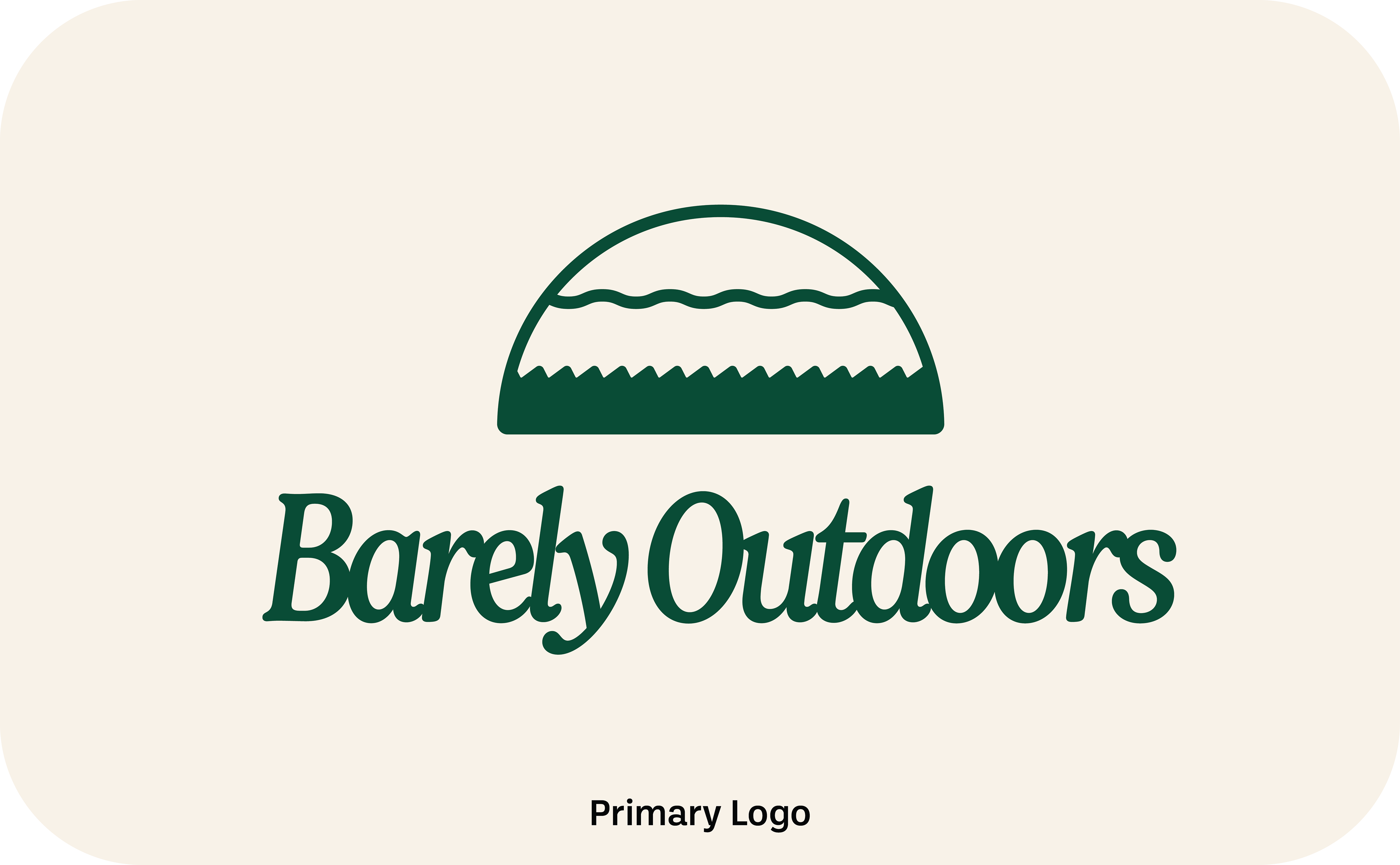
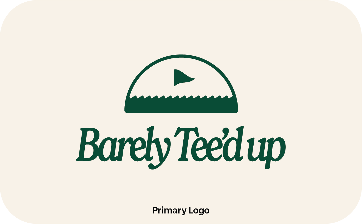
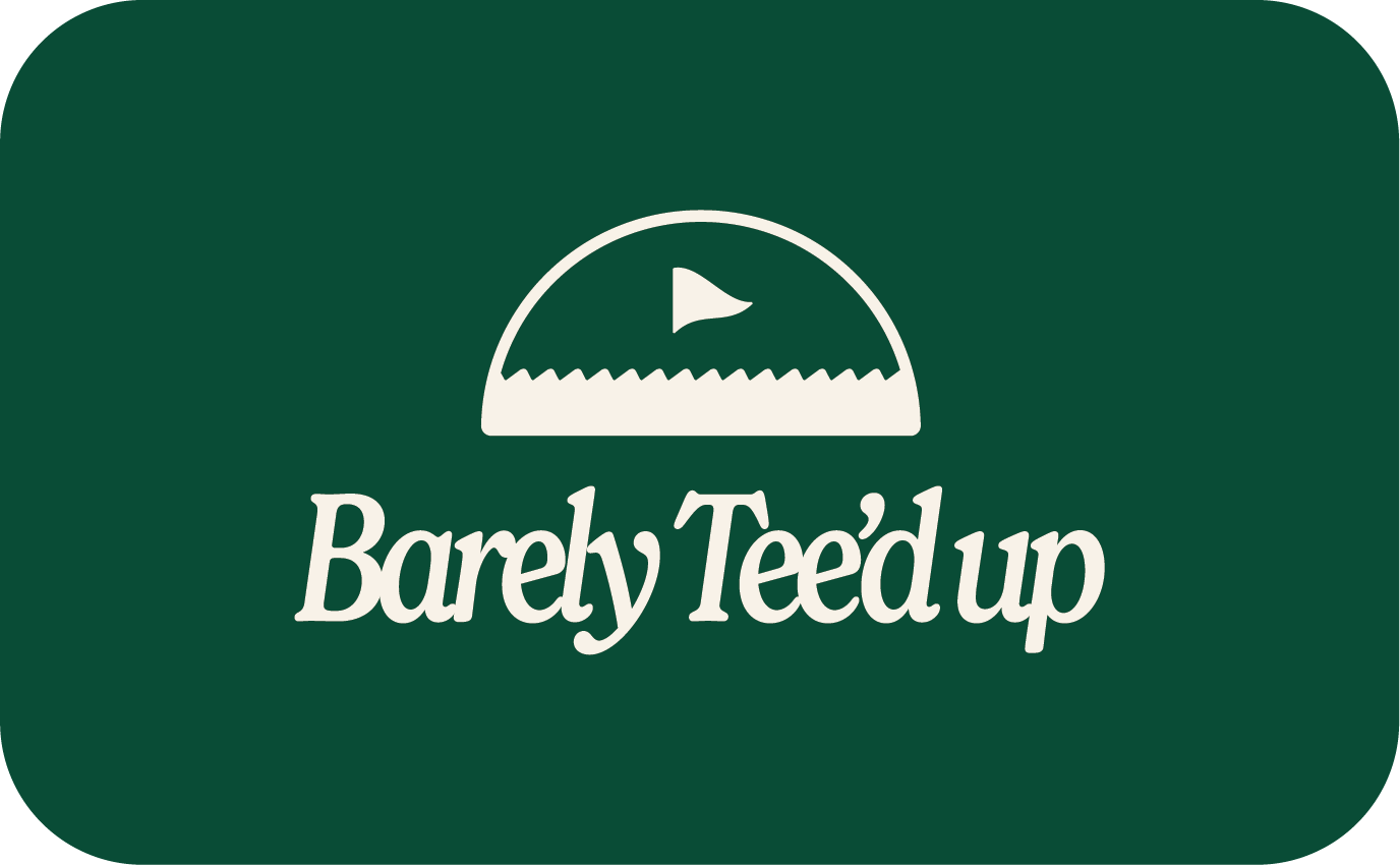
Primary Logo: A single mark that encapsulates the master brand, intended for use where space allows for maximum visibility, such as website headers and signage.
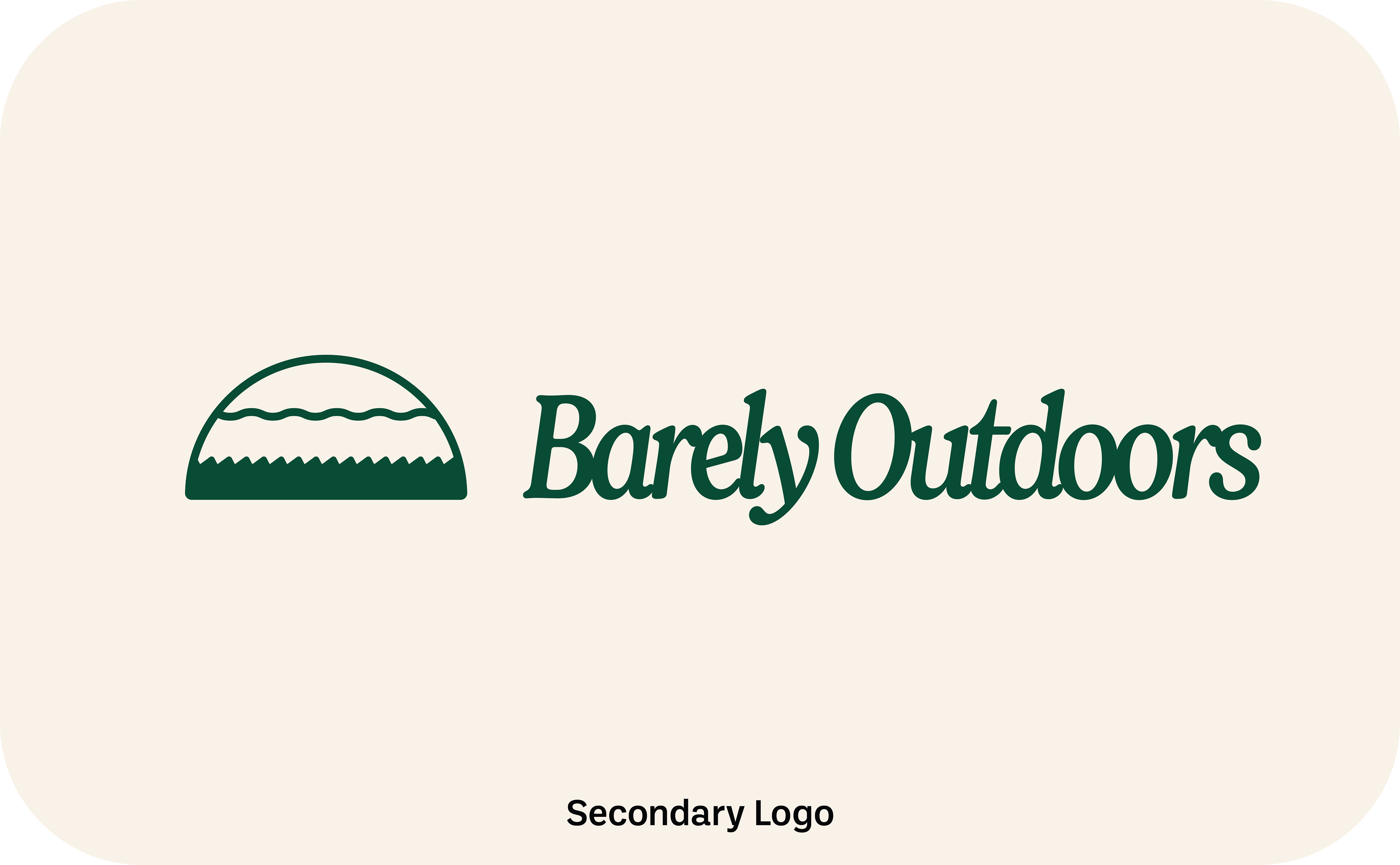
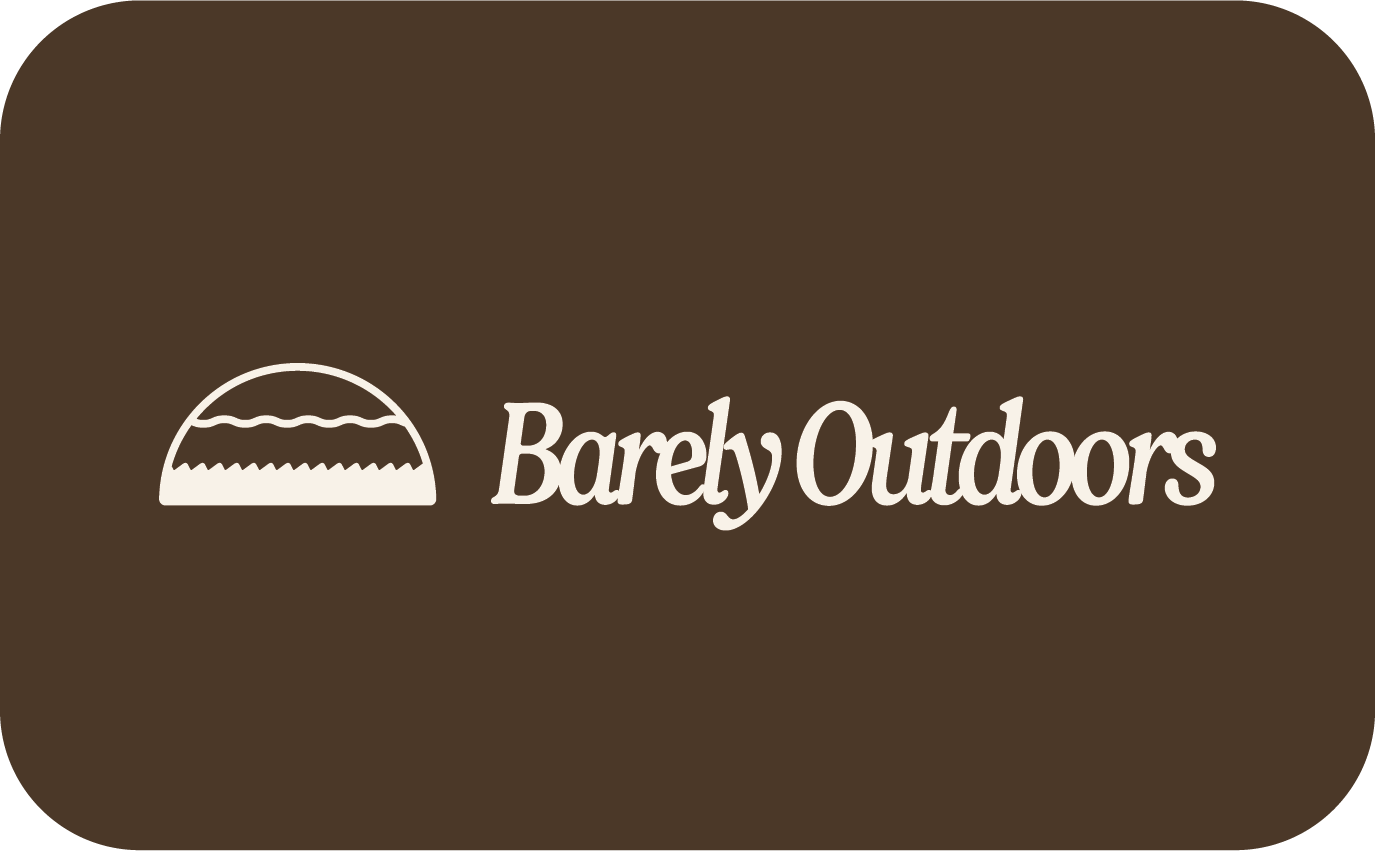
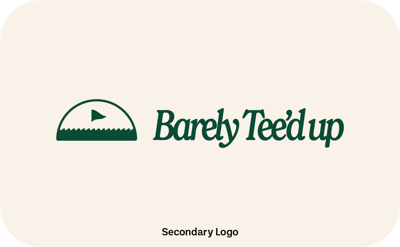
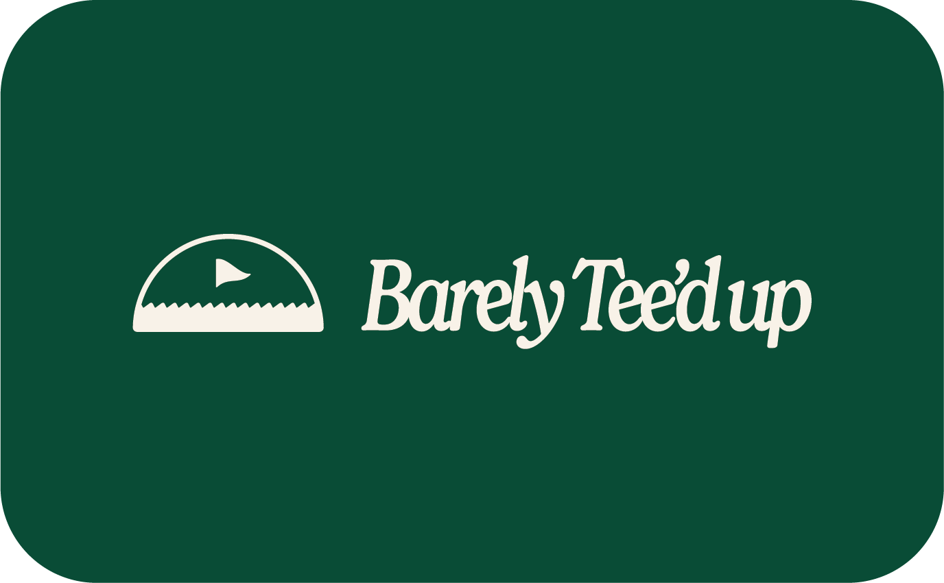
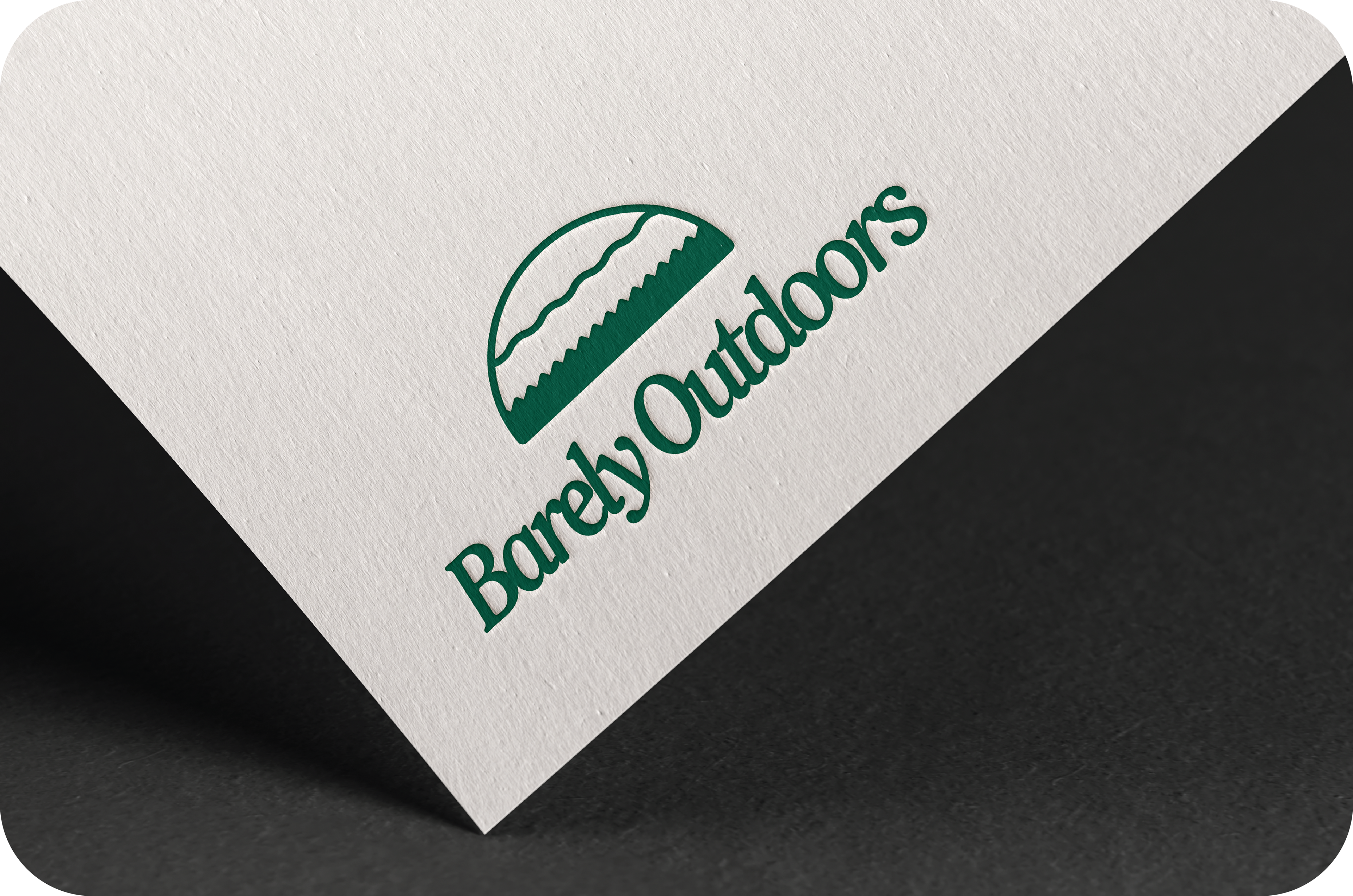
Secondary Logo: A stripped-down, alternate variation for restricted spaces like business cards and invoices.
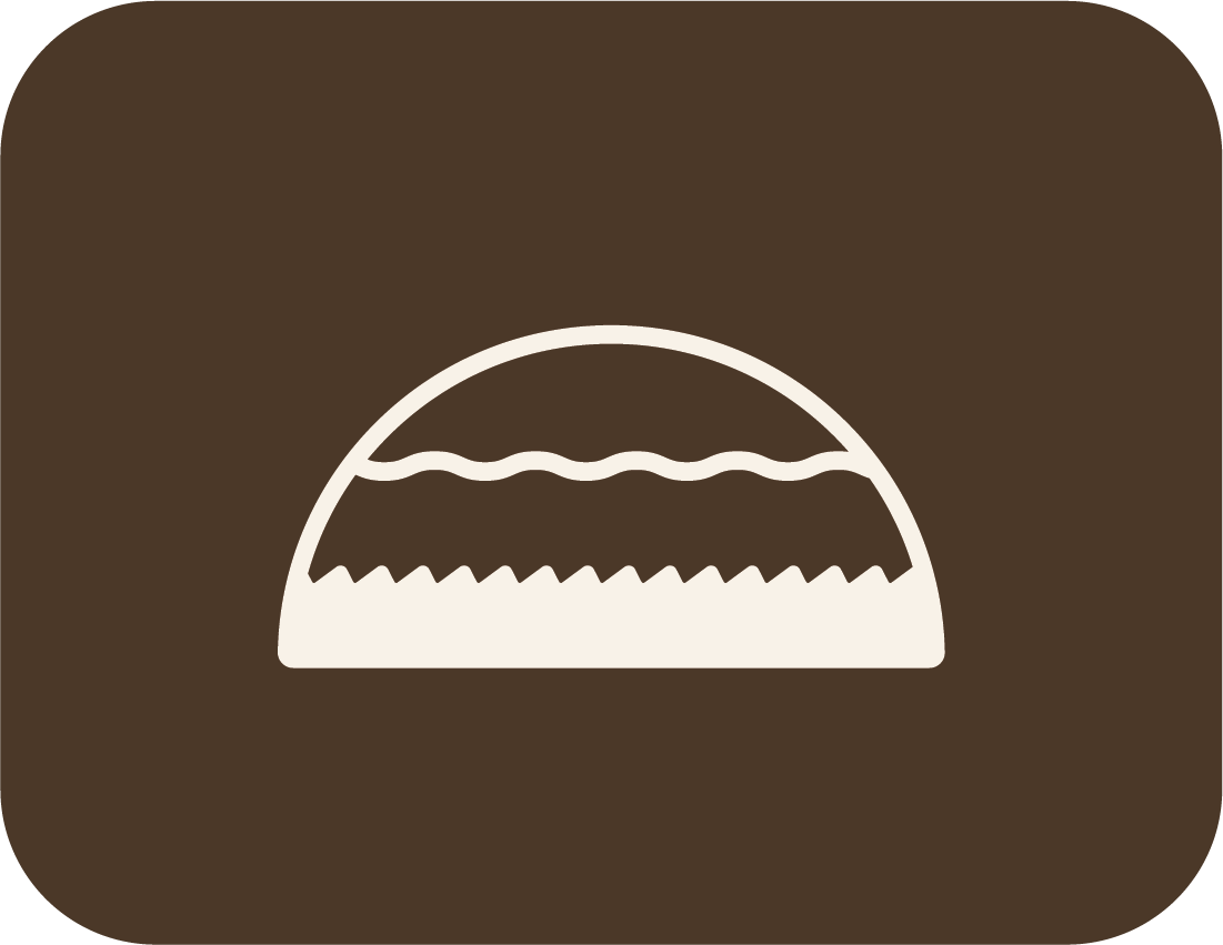
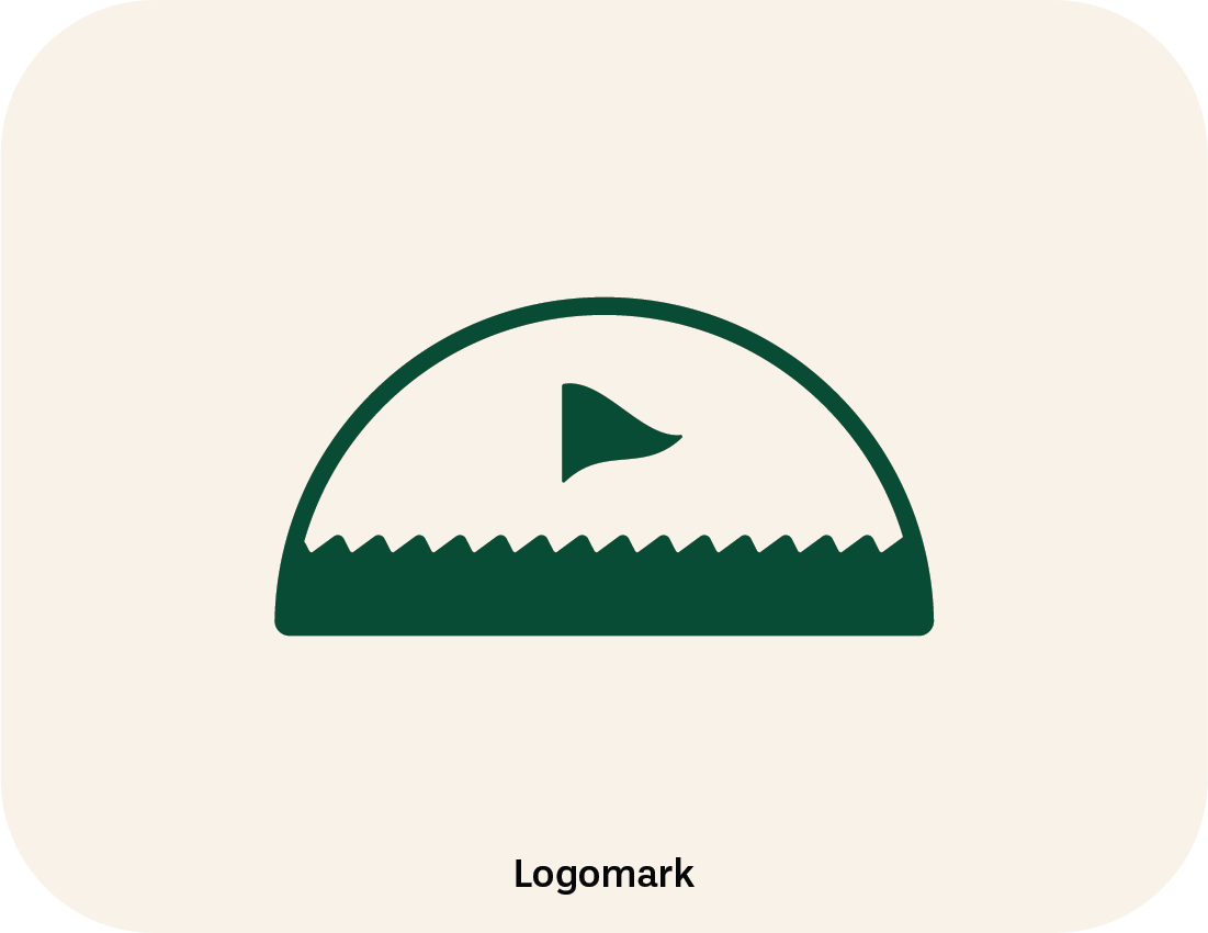
Submark: The smallest, most simplistic versions of the logo, including the Barely "B" and golf-specific icons, ensuring the brand is instantly recognisable at small scales on social media and mobile headers.
Barely Outdoors (Master Brand)
BARELY TEE'D UP (SUB-BRAND)

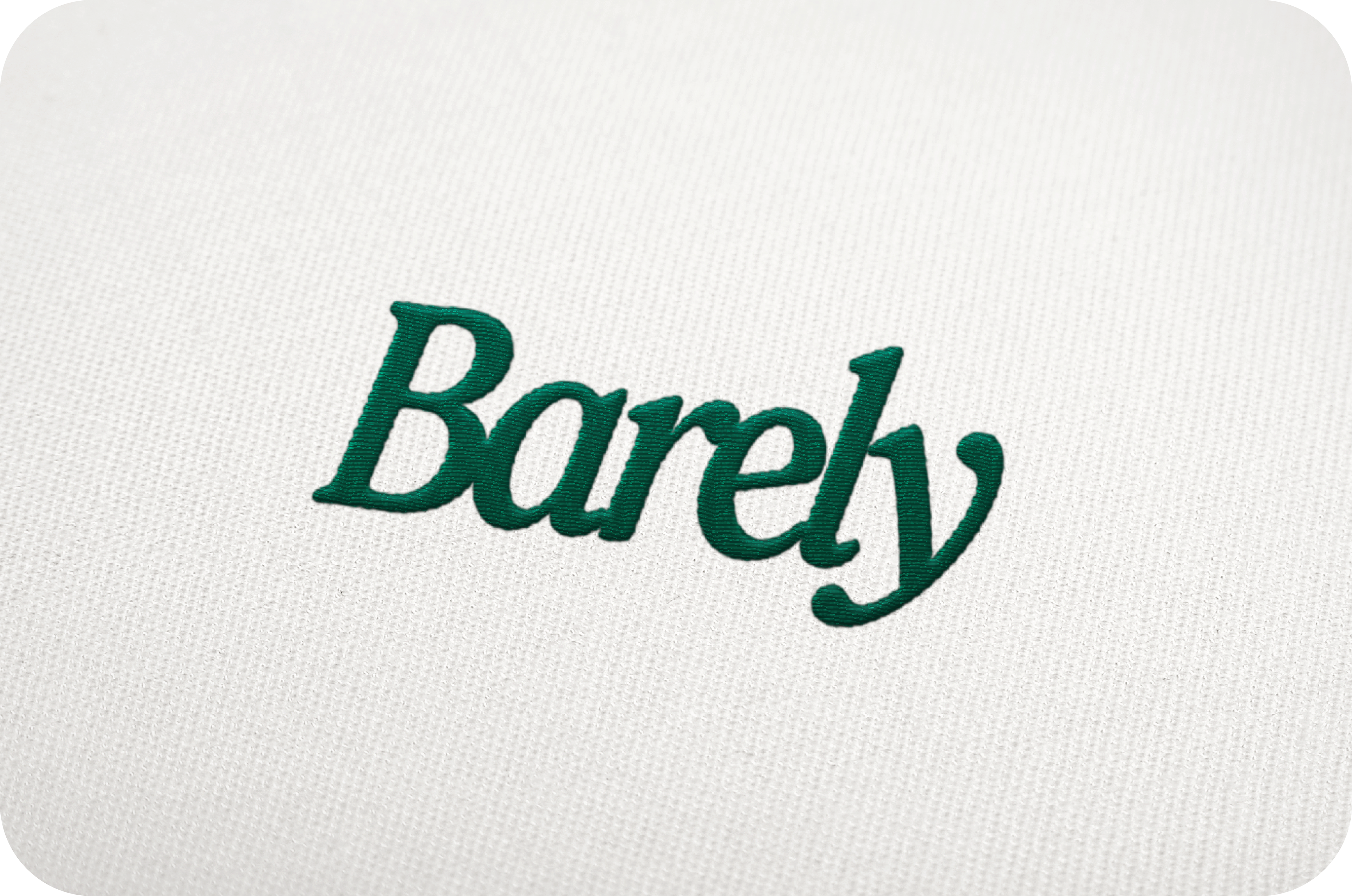
THE TYPOGRAPHY
The typography creates a clear hierarchy and a cool, classic, and completely unpretentious tone.
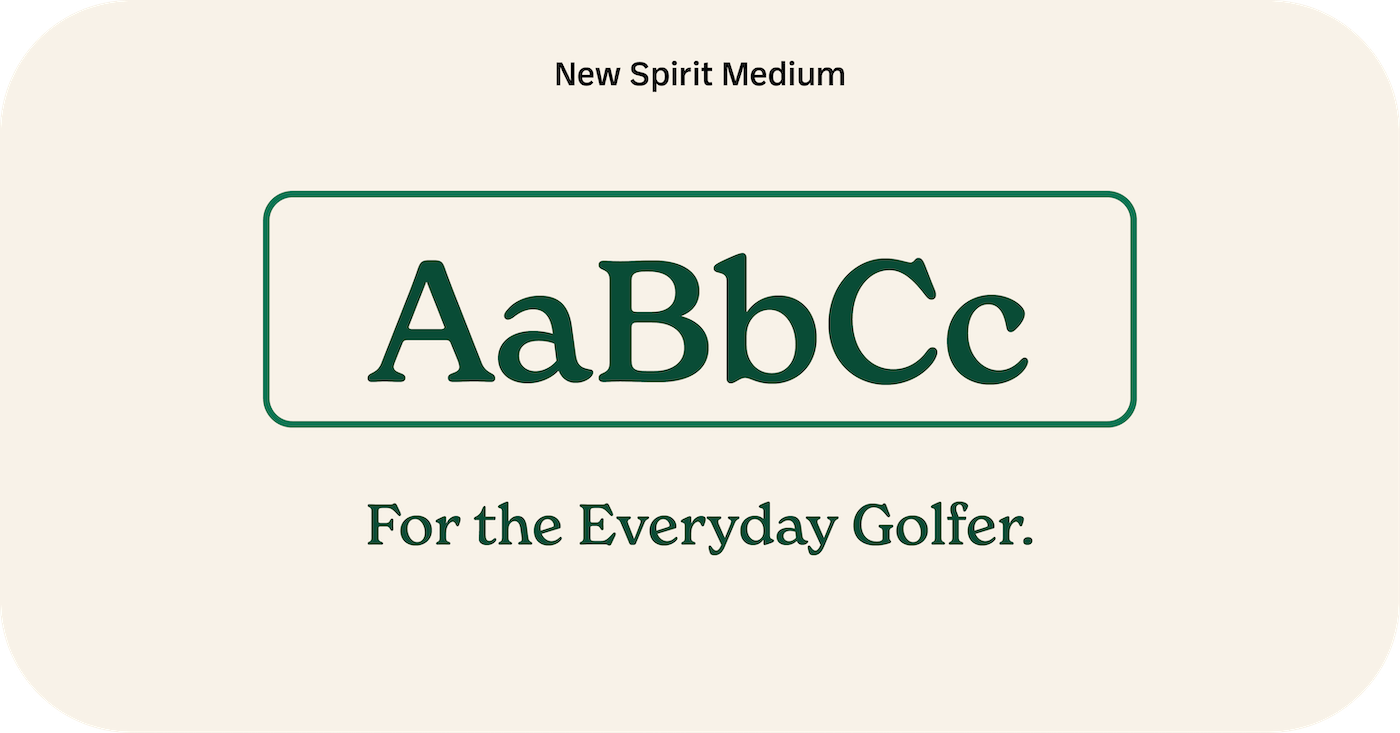
Primary Type: New Spirit Medium is used for headlines. It features a quirky retro aesthetic that remains refined and familiar.
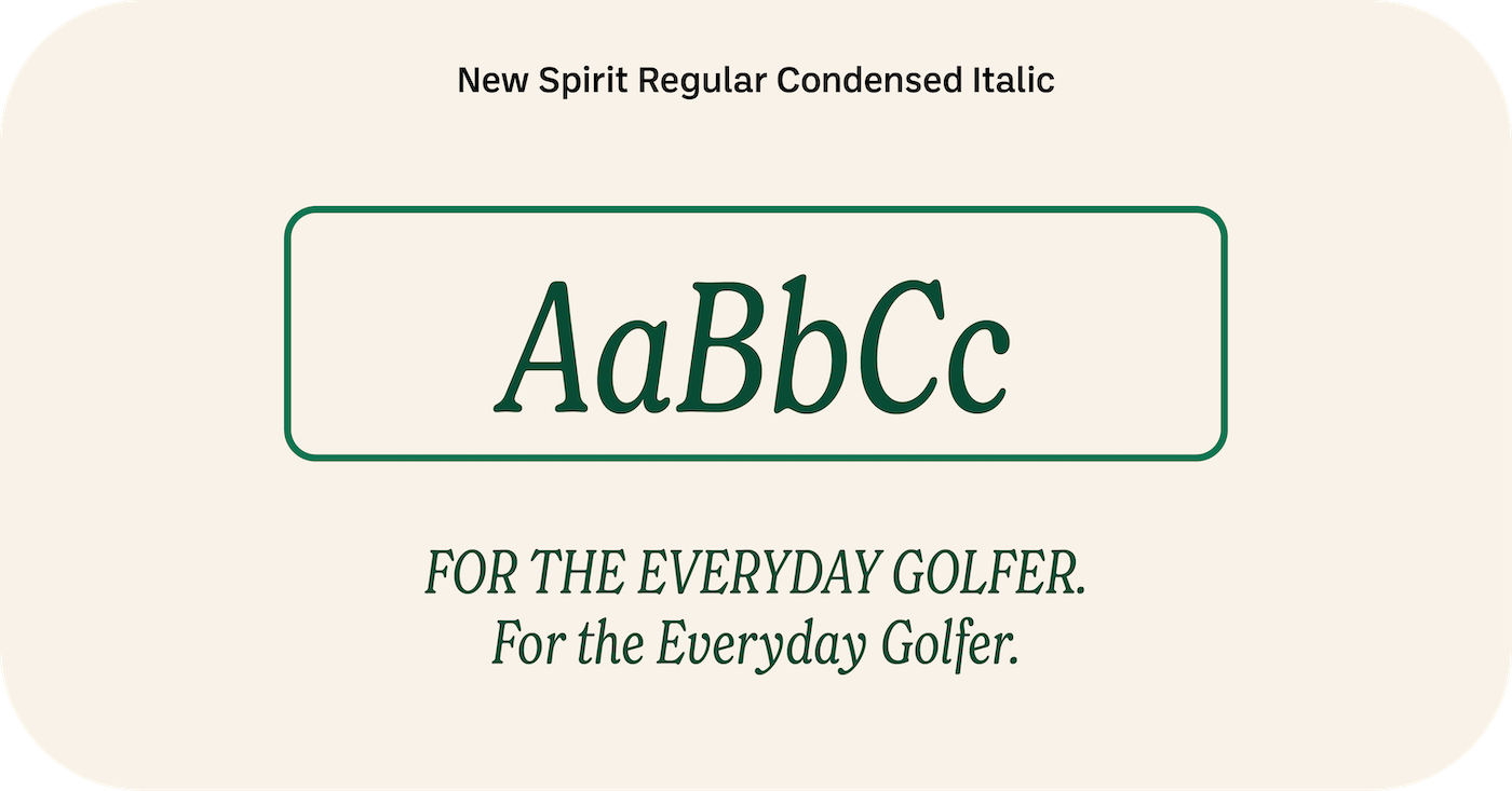
Secondary Type: New Spirit Regular Condensed Italic is used for sub-headers to provide a stylish pair to the primary type.
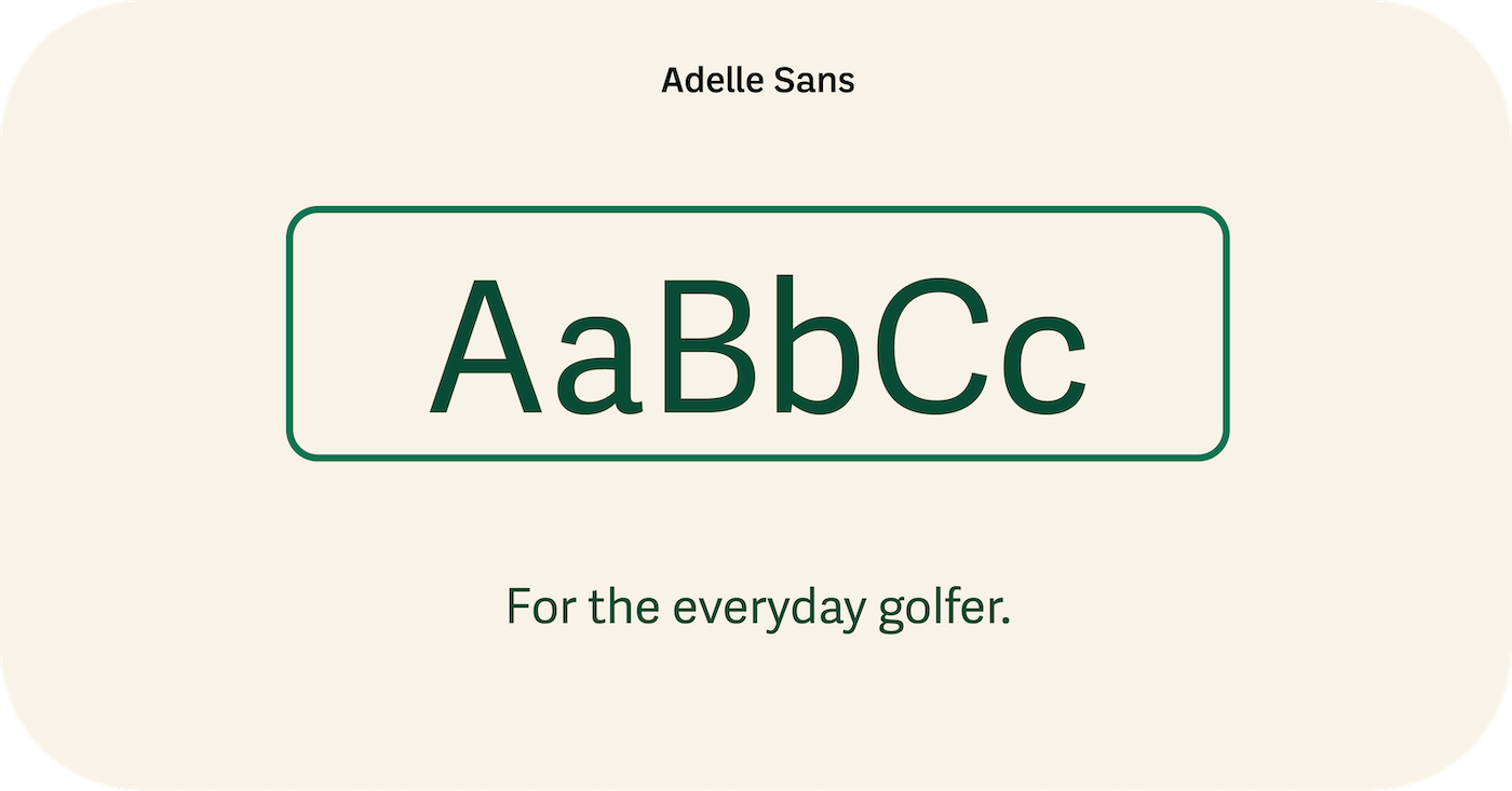
Body Type: Adelle Sans was selected for all body text for its clean, versatile, and friendly feel, offering humanist qualities that keep the brand personable.
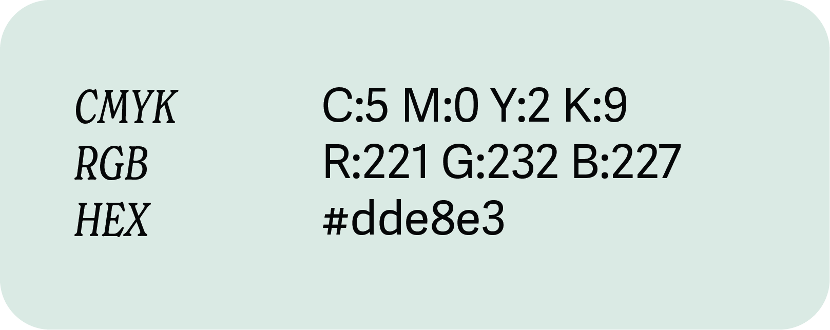
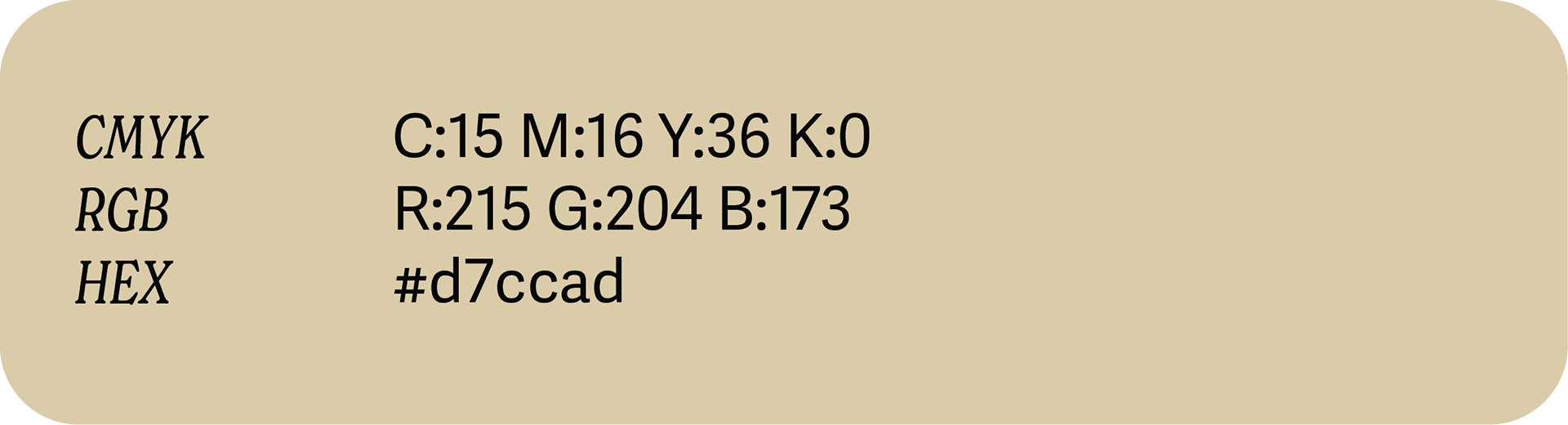
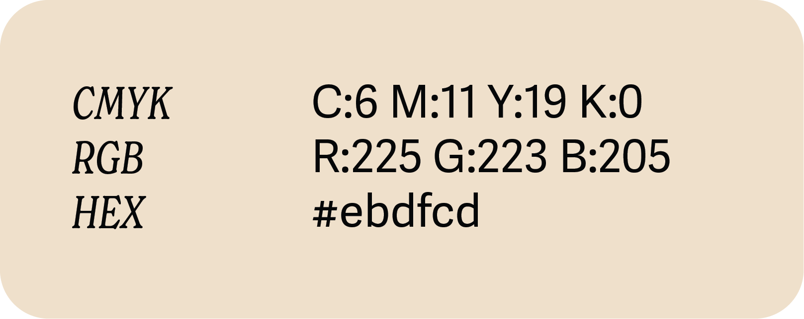
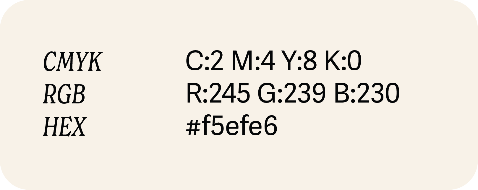
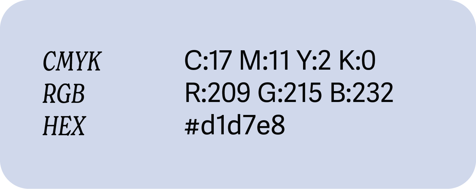
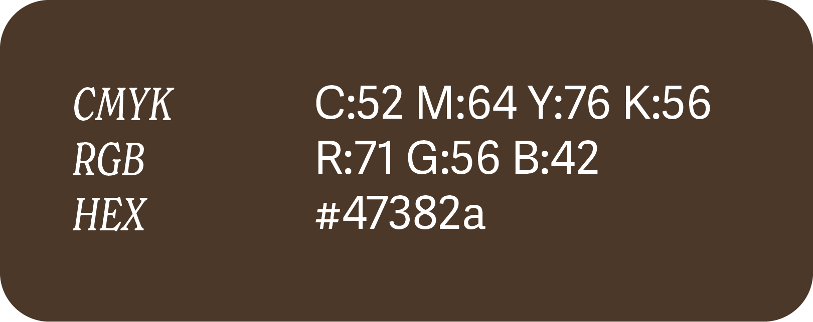
THE COLOUR PALETTE
The palette is inspired by the outdoors and authentic country club culture, avoiding anything too pretentious or "try-hard hipster".
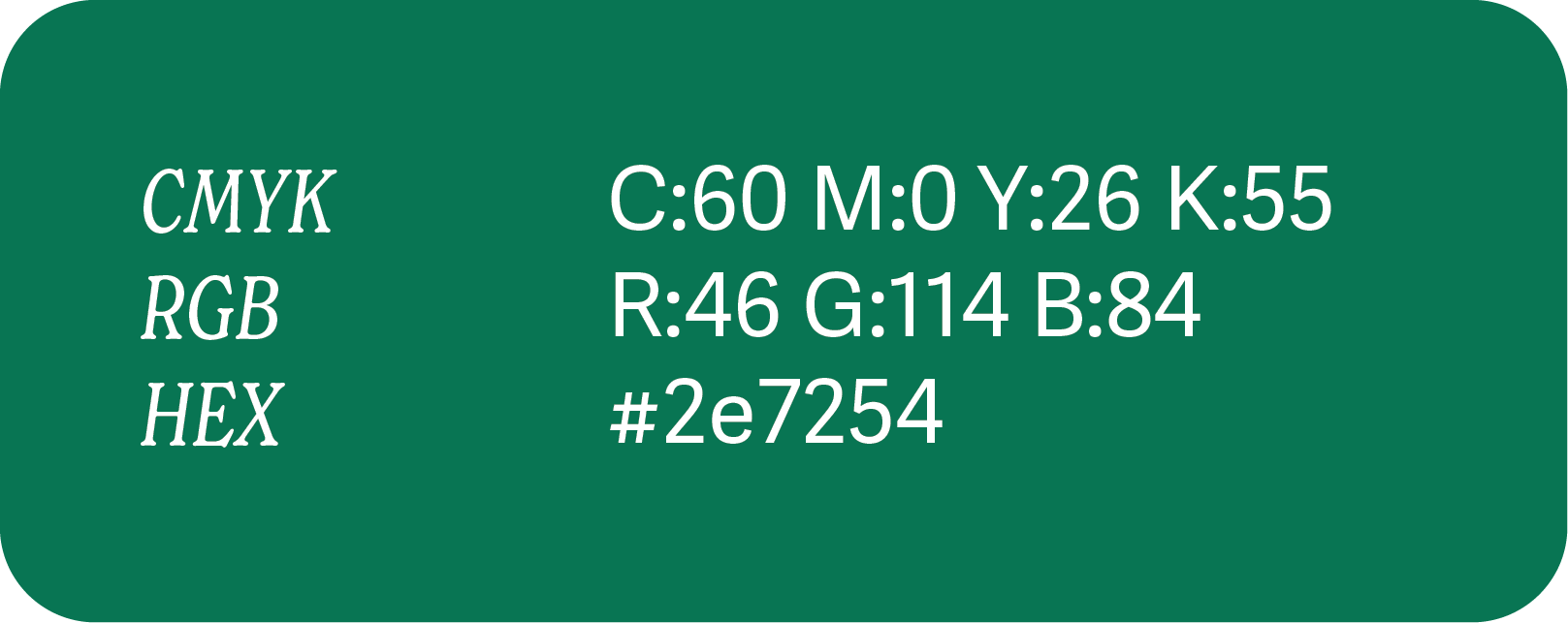
Core Greens: Deep, grounded greens like #1e4a36 and #2e7254 represent the performance and natural environment of the course and trail.
Earth Tones: Warm neutrals such as #47382a (Deep Brown) and #d7ccad (Sandy Beige) reflect the brand’s rugged Aussie roots and country style.
Accents: Light, airy tones like #f5efe6 provide a clean background that allows the primary colours to pop.


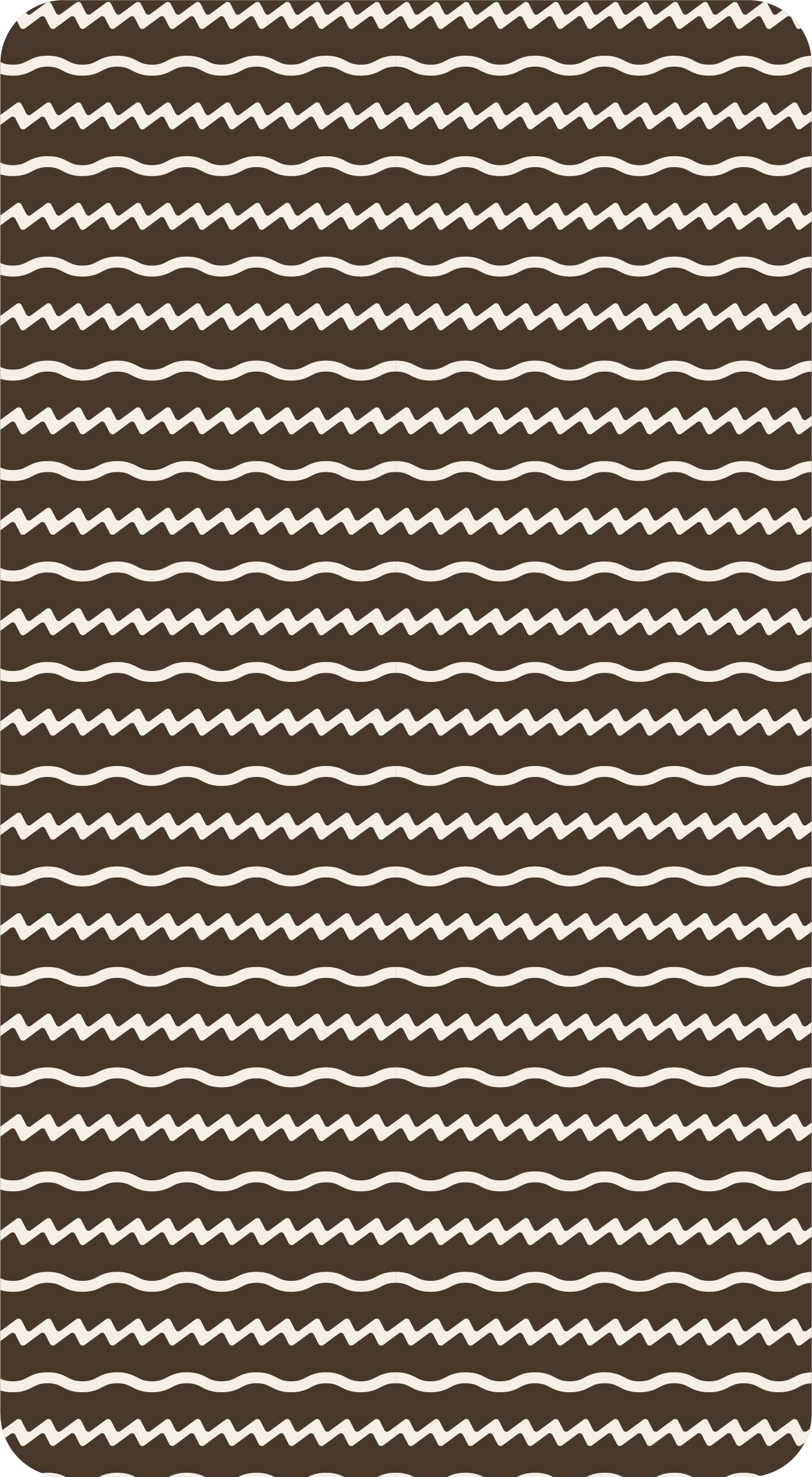
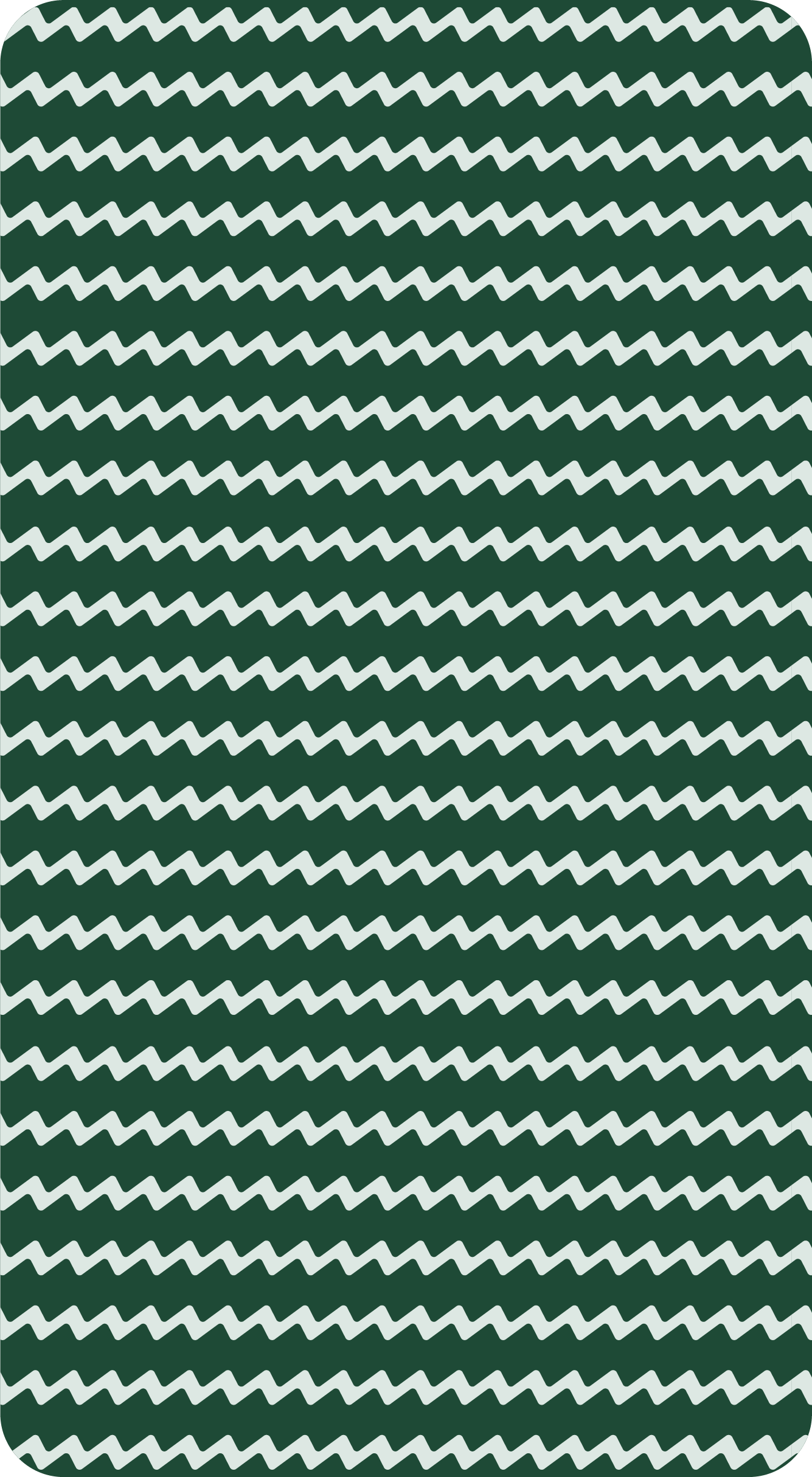
THE BRAND PATTERNS
To add depth and a distinctive personality, a series of custom patterns were developed to help the brand stand out from competitors.
Barely Outdoors Pattern: A combination of wavy and zig-zag lines that suggest landscape elements like water and grass, reinforcing the outdoor lifestyle.
Barely Tee’d Up Pattern: A golf-specific variation used to distinguish the community platform and its associated apparel.
THE BRAND IN USE
The final identity successfully establishes Barely Outdoors as a definitive one-stop shop for recreational sports enthusiasts. By combining a community-driven "bible" of course reviews with versatile apparel, the brand is positioned to scale into new verticals while remaining grounded in the laid-back culture it serves.
Authentic Community: A platform where real players share honest insights and plan their next adventure.
Versatile Apparel: High-performance gear that fits just as well in the office as it does on the 18th green.
Scalable Identity: A master brand ready to travel the world and expand into every outdoor passion.
CLIENT TESTIMONIAL
"Harry created something better than we could ever imagine! We are absolutely thrilled with the brand he has helped to create- it’s professional, fun and everything we could have hoped for! Absolutely we would hire him again!"
Rhys Watkins, Founder
Let's get started on your vision together!