THE BRIEF
The goal was to create a complete brand identity for Mya, a new online platform supporting women through pregnancy and postpartum. The branding needed to empower women with knowledge and confidence, filling a gap in personalised care with expert guidance. The core challenge was to visually communicate the brand's key values: Safety, Warmth, Approachability, and Professionalism.
THE LOGO
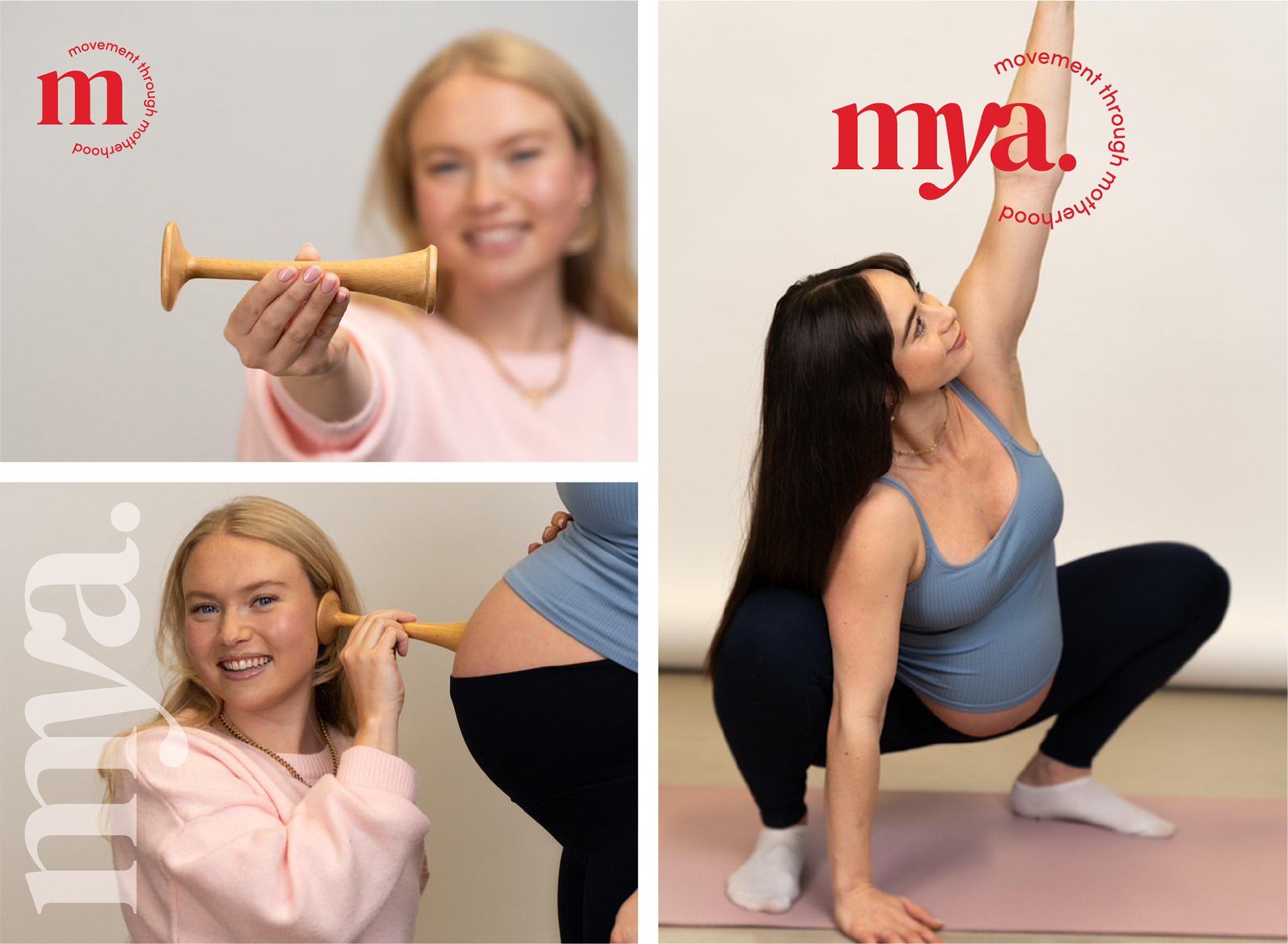
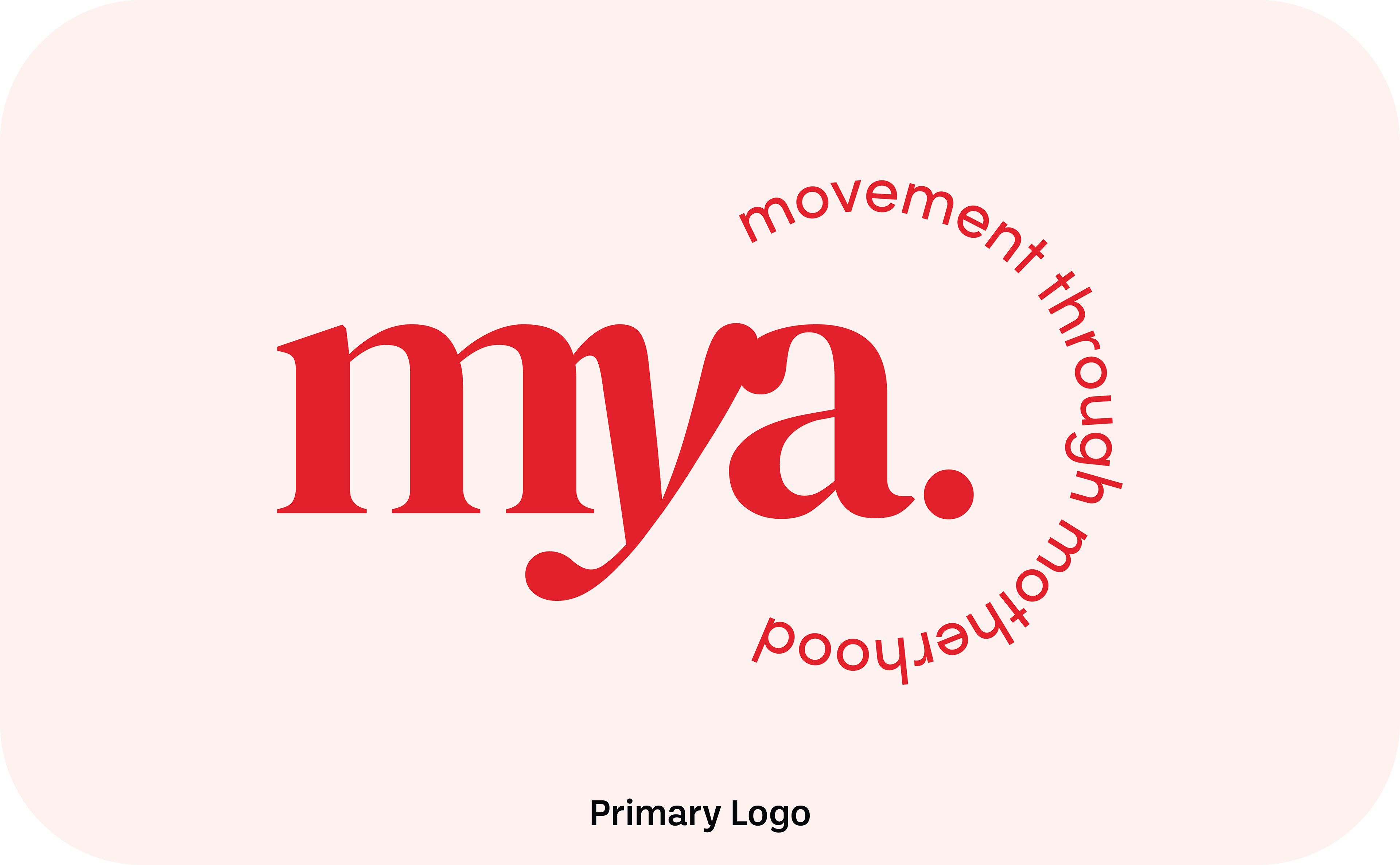
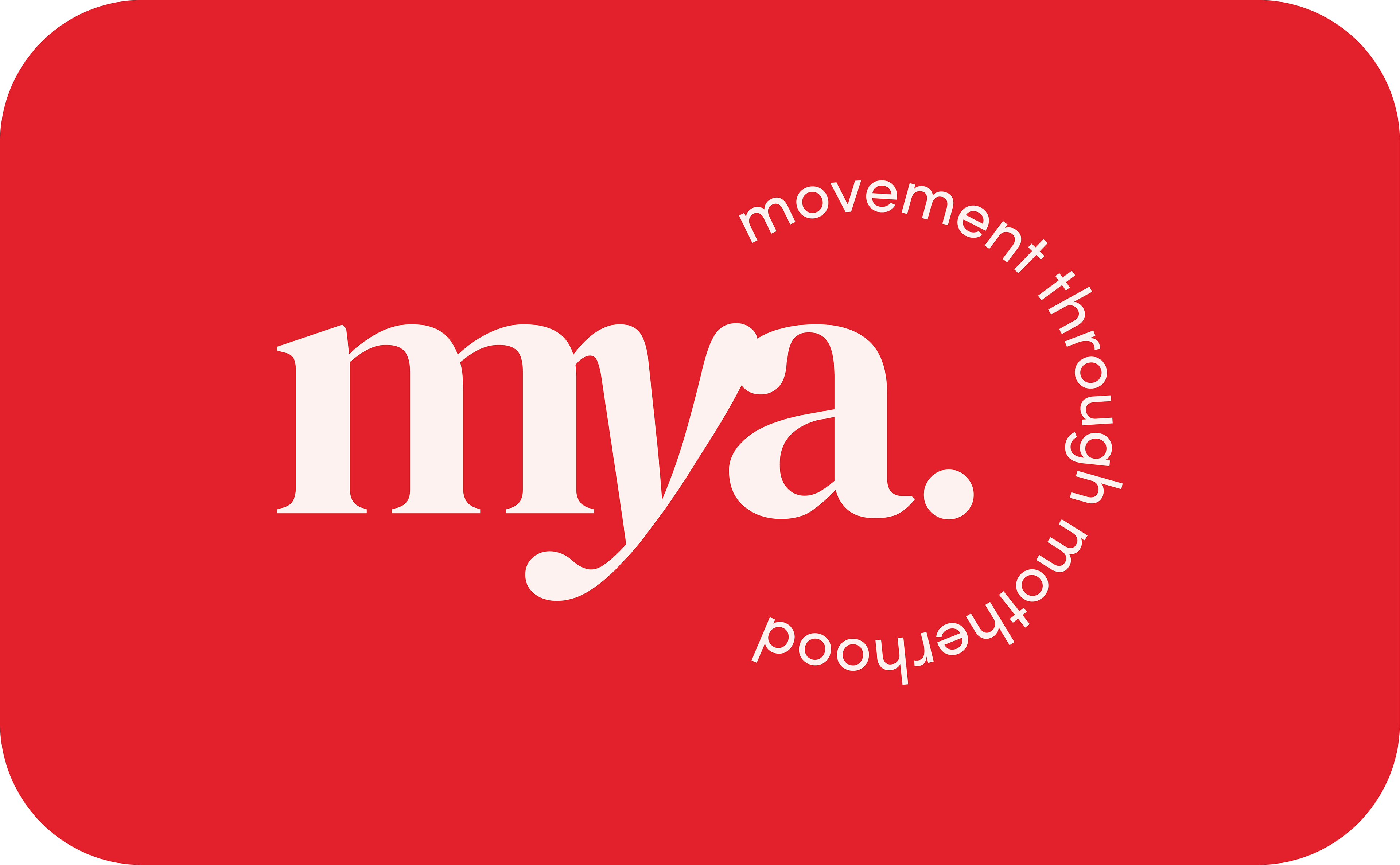
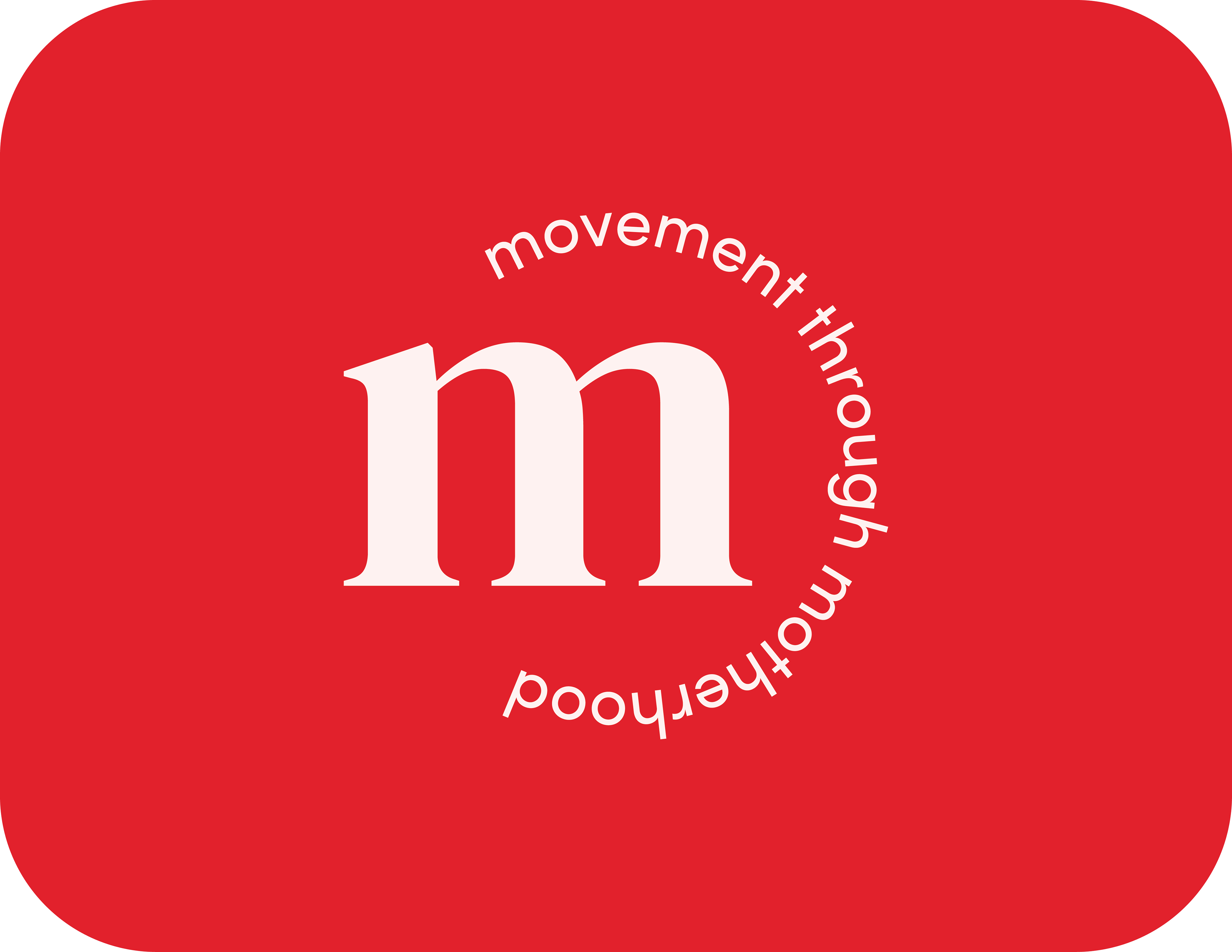
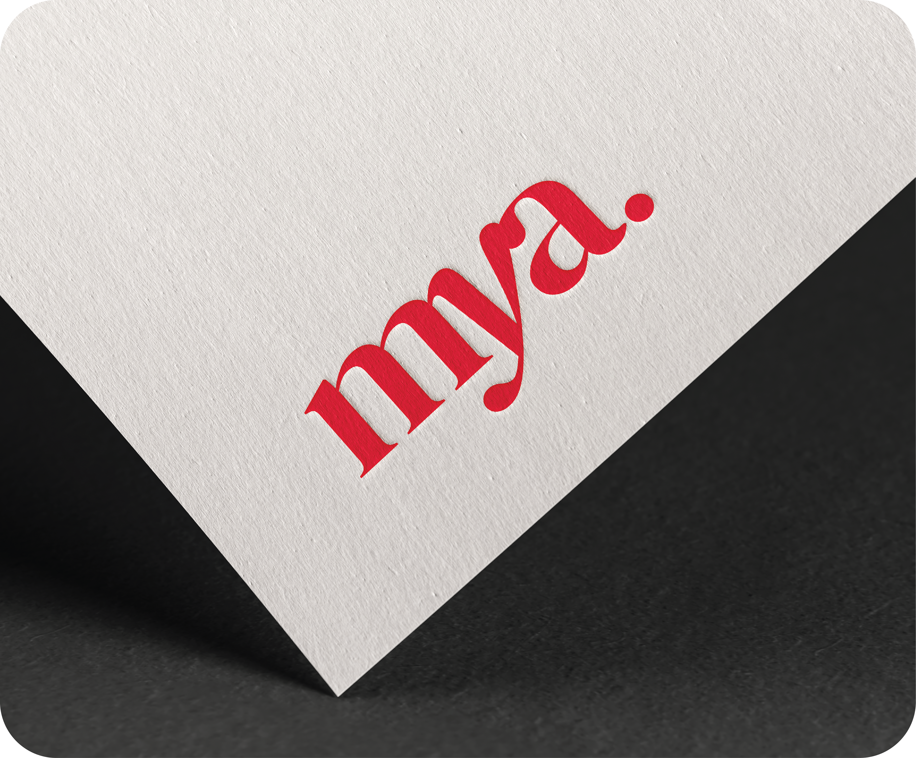
The Mya logo was designed to be a memorable and versatile visual anchor for the brand. The primary logo features a custom, flowing wordmark that feels both gentle and strong. The tagline, "movement through motherhood," gracefully encircles the name, visually representing the supportive and holistic journey Mya provides.
To ensure brand recognition across all platforms, a flexible logo system was developed:
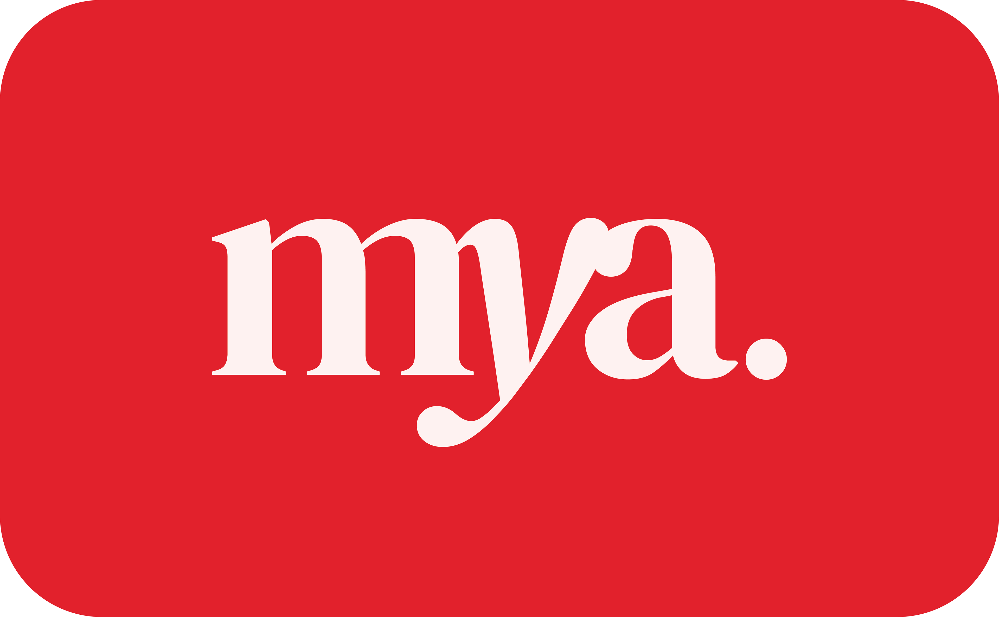
Primary Logo: The full logo with the tagline, ideal for primary branding on website headers and large print materials.
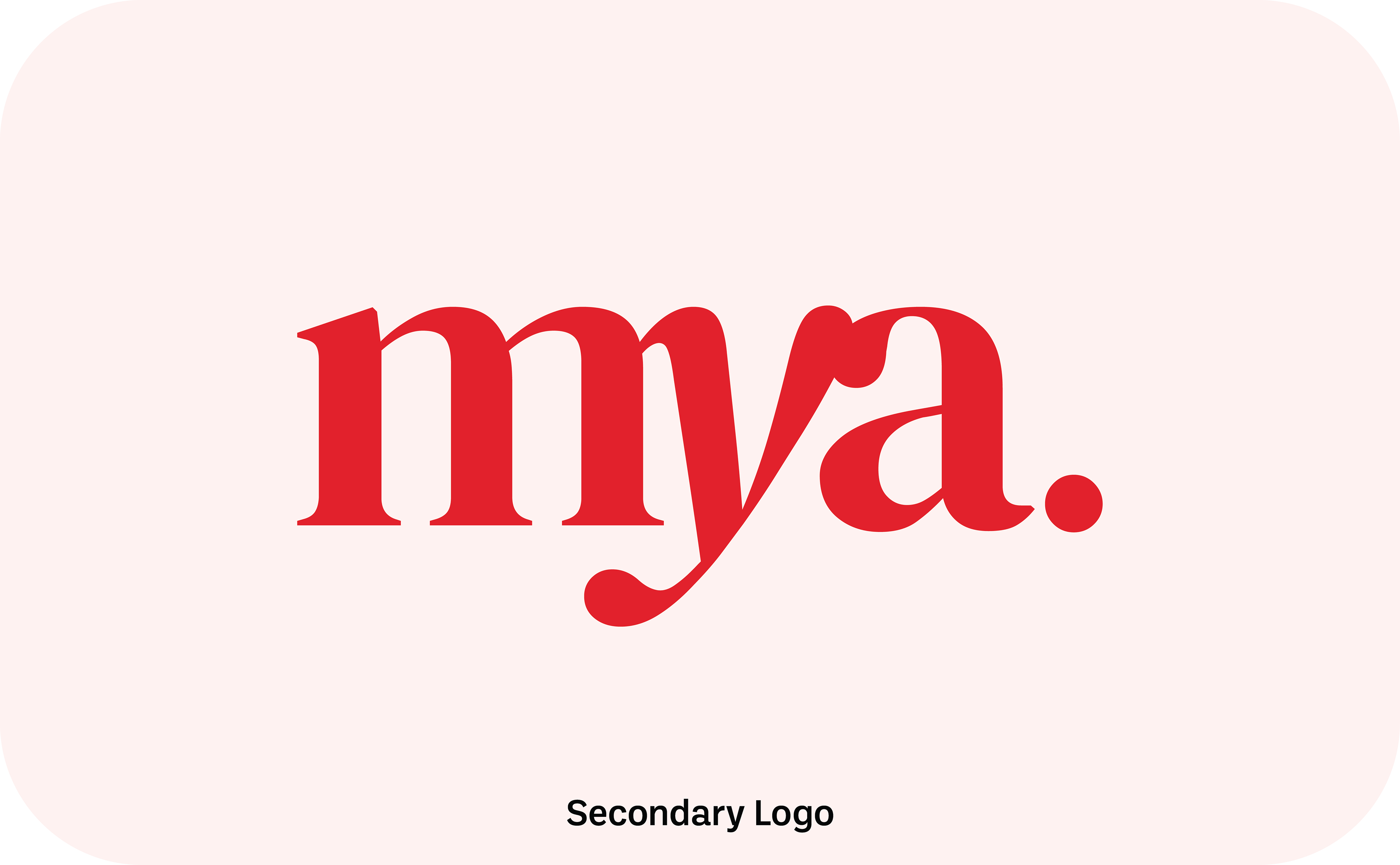
Secondary Logo: A more compact version without the circular tagline, perfect for business cards and invoices where space is limited.
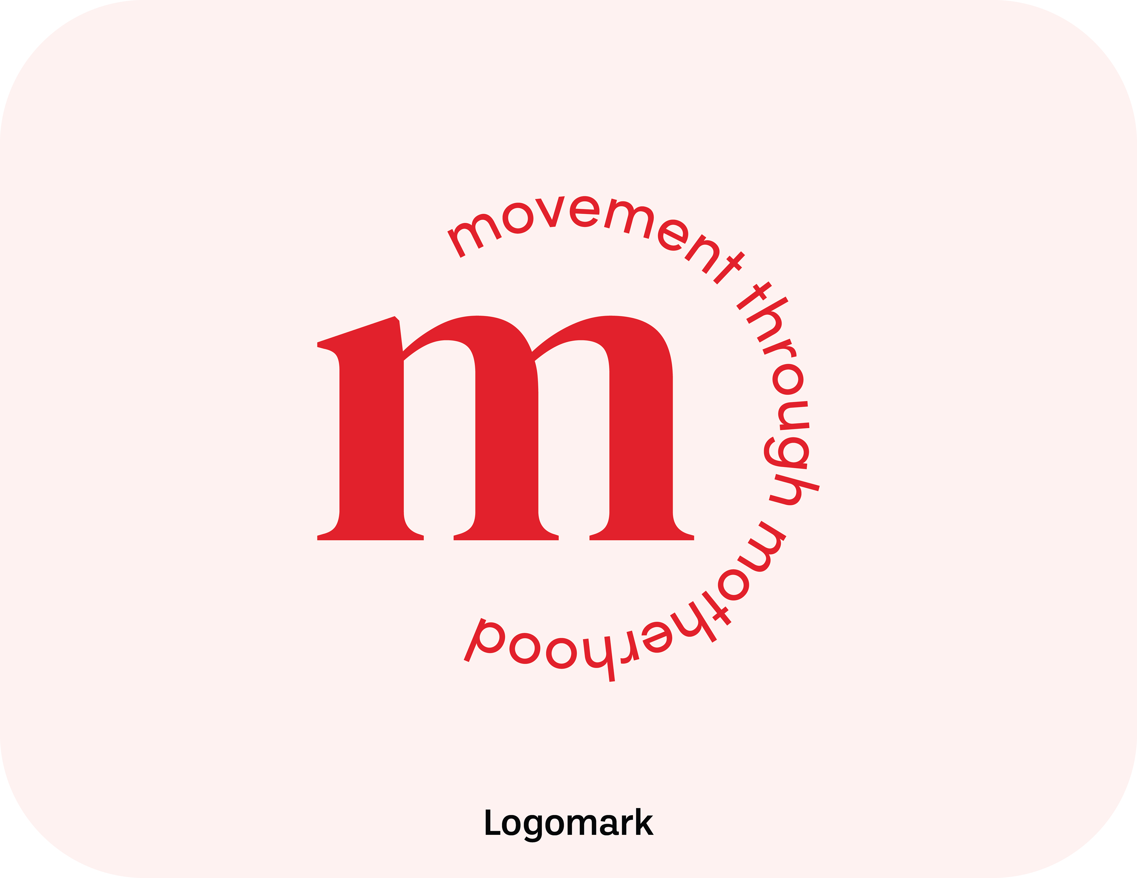
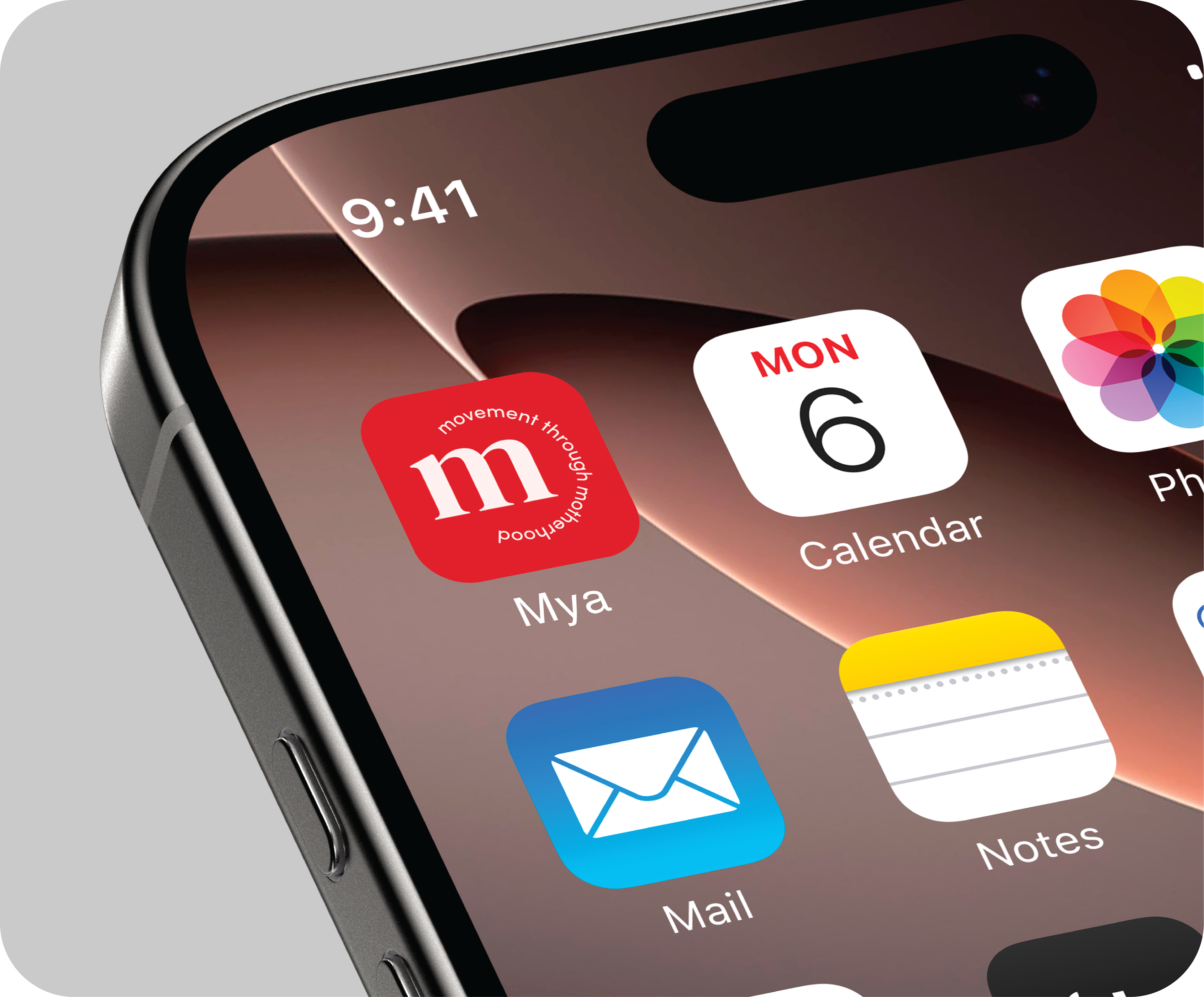
Submark Logo: The stylized "m" monogram, designed for small-scale applications like social media profile images and the website favicon, ensuring the brand is instantly recognizable at any size.
THE TYPOGRAPHY
To establish a clear visual hierarchy and a professional yet approachable tone, two typefaces were selected:
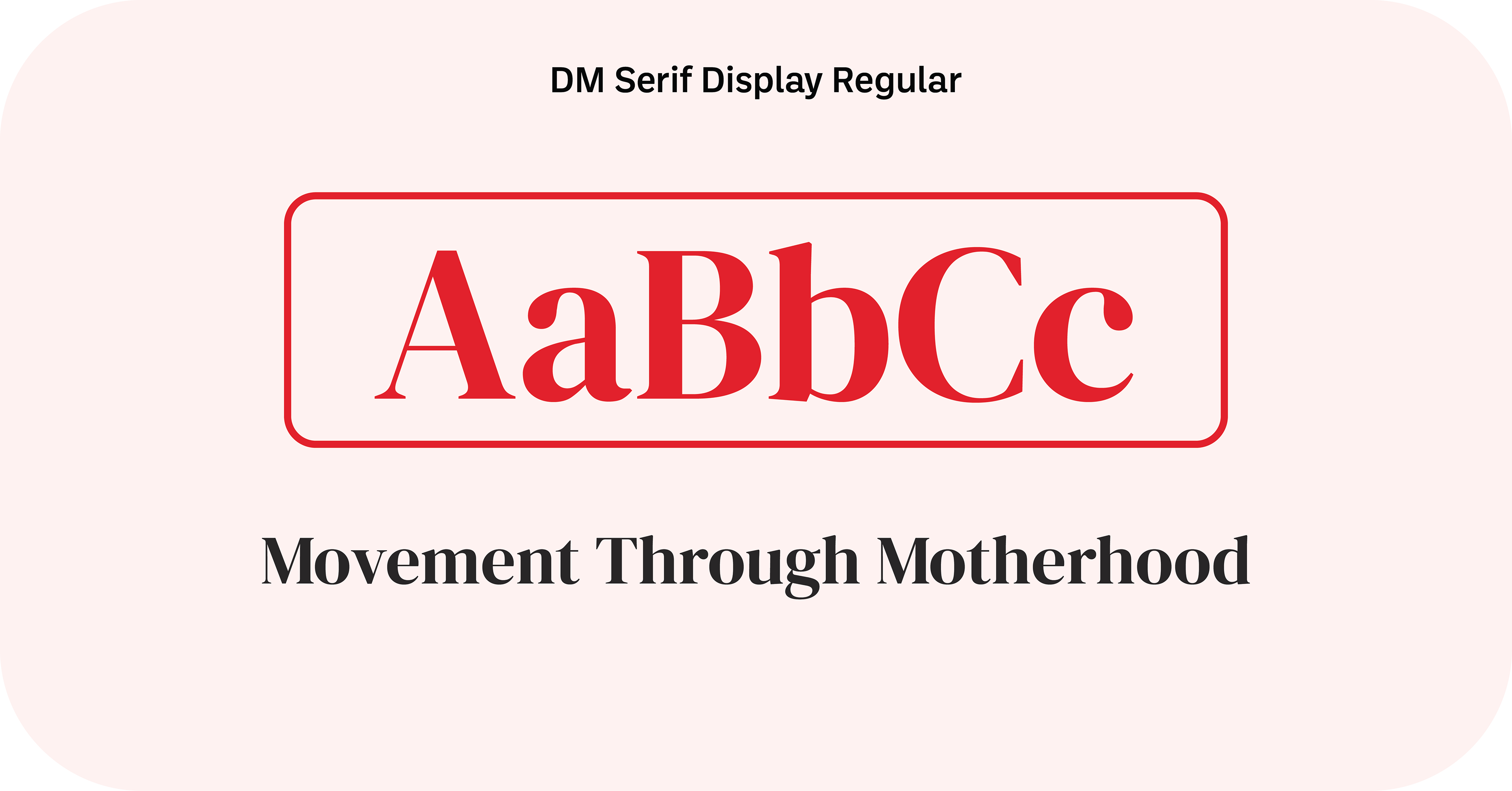
Primary Type (Headlines): DM Serif Display Regular is used for all headlines. Its high-contrast, delicate serifs provide an elegant and established feel, used in sentence case for a softer approach.
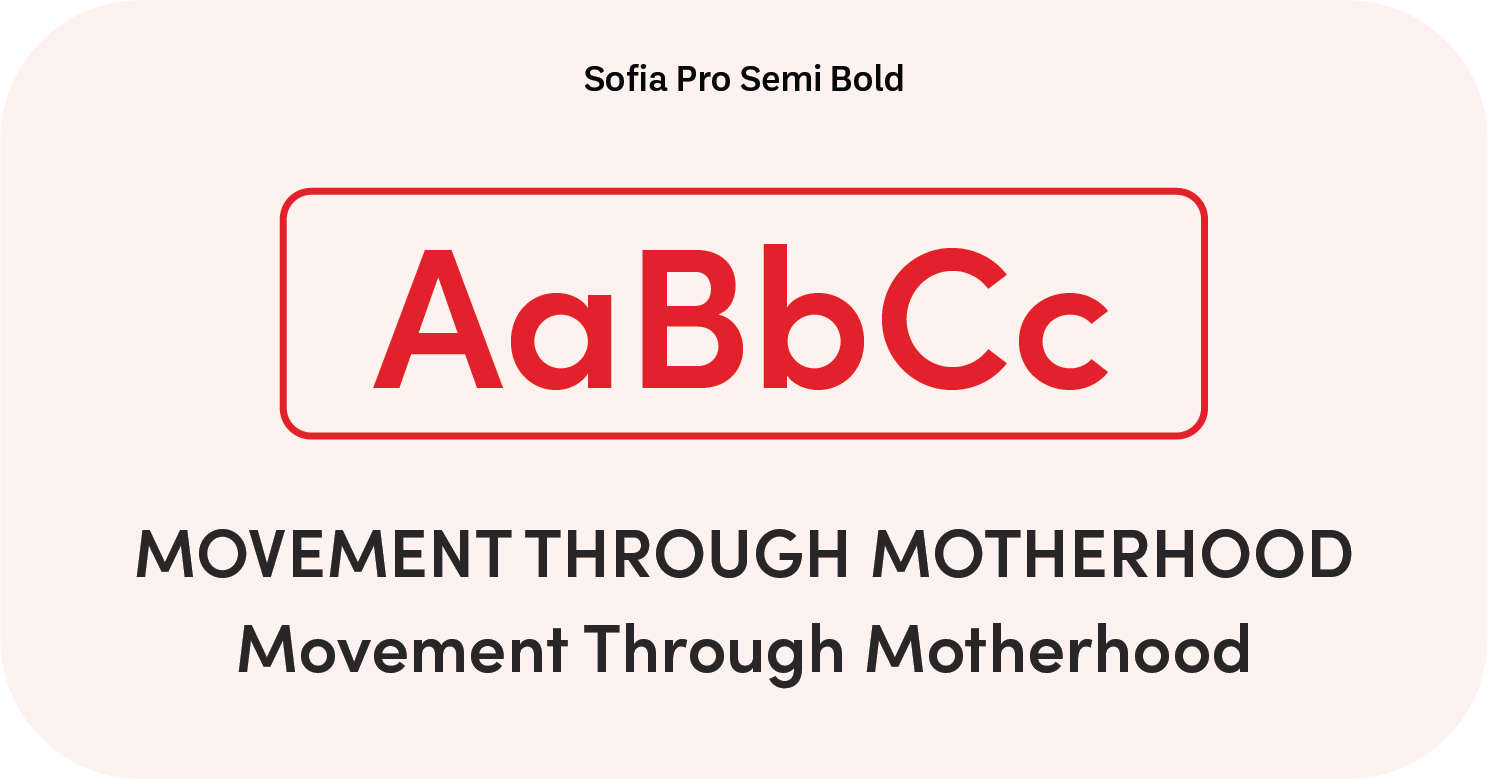
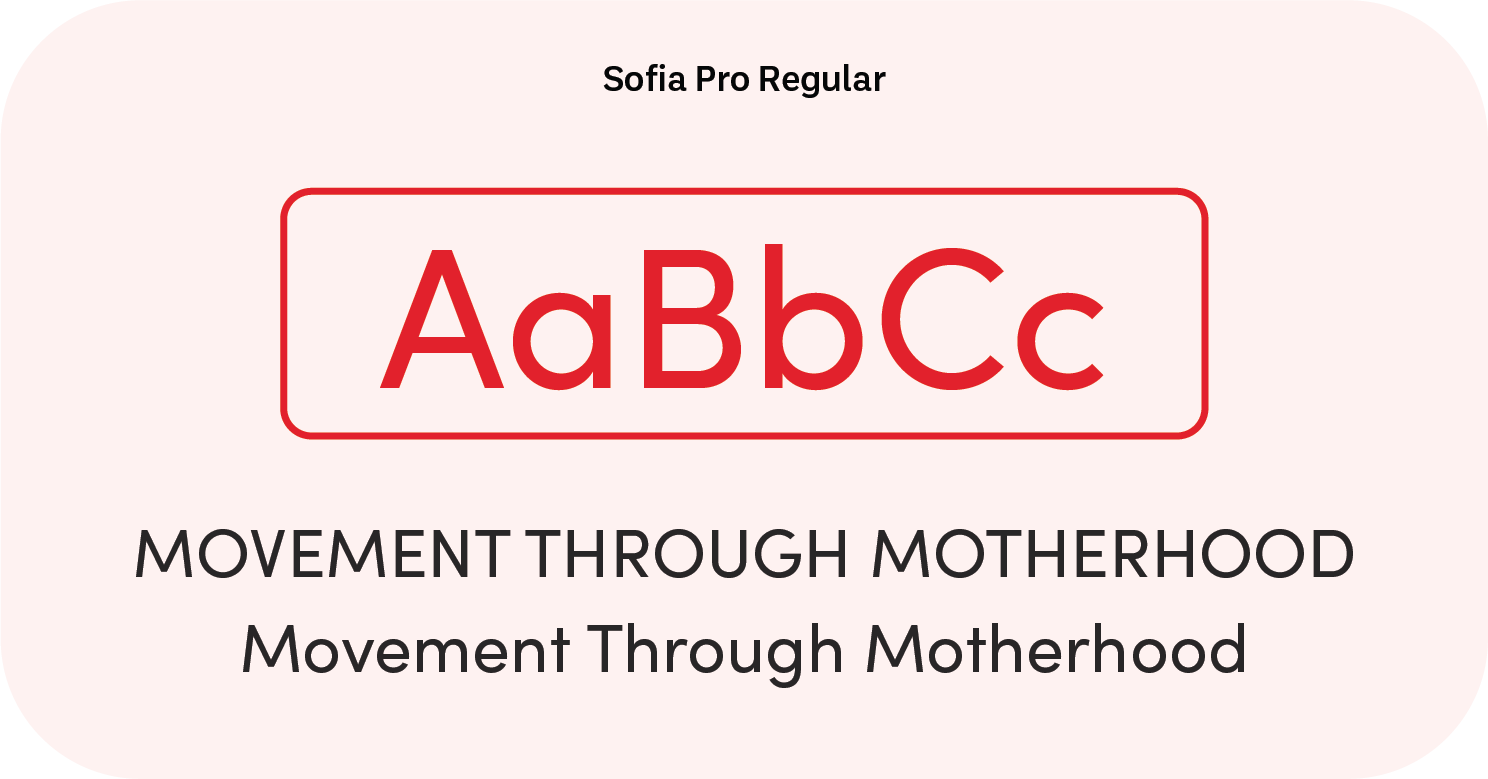
Secondary Type (Subheaders & Body): Sofia Pro is a geometric sans-serif that brings a modern, harmonious, and rounded feel. Sofia Pro Semi Bold is used for subheaders, while Sofia Pro Regular is used for all body text, ensuring content is clear, legible, and friendly.
THE COLOUR PALETTE
The colour palette was chosen to express emotion, create emphasis, and build a strong visual association with the brand's values. The colours are warm, professional, and reassuring.
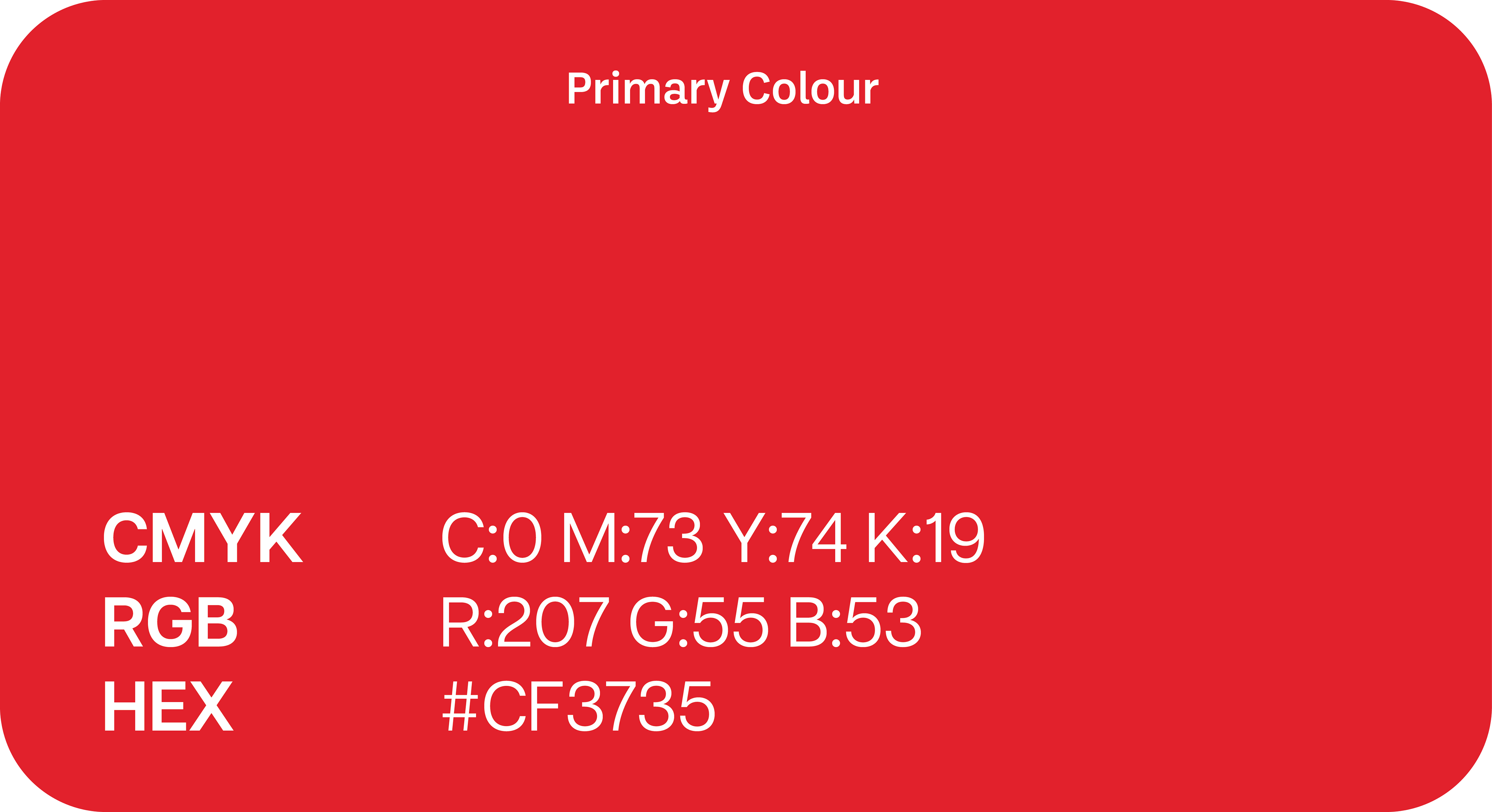
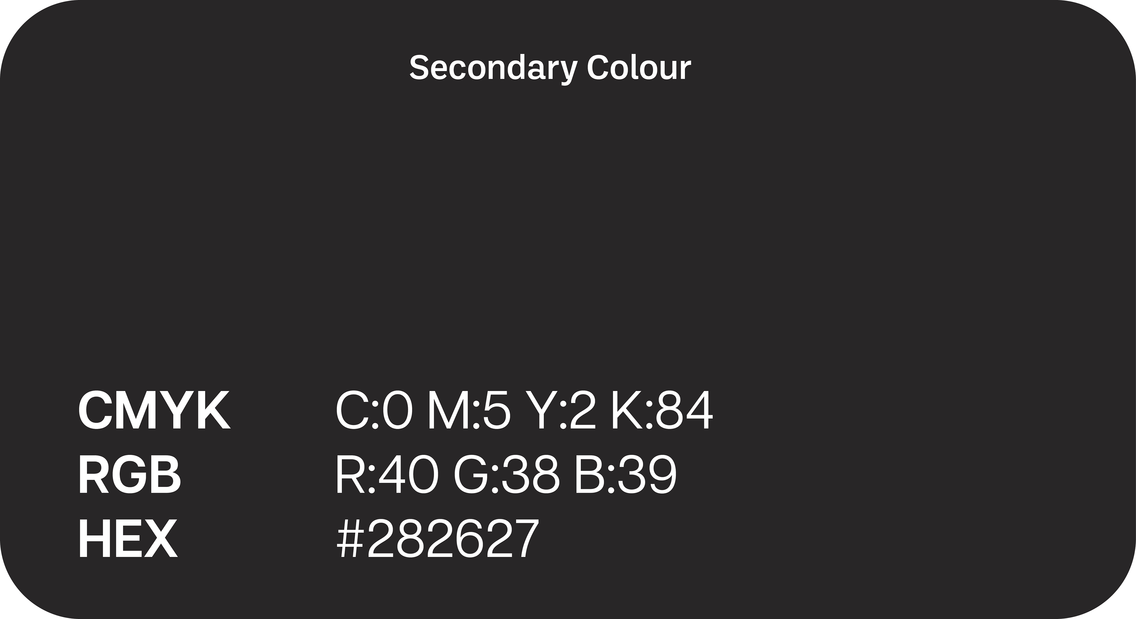
Brand Colours: The primary palette consists of Persian Red, a strong and confident colour, paired with the soft and calming Seashell and the professional Raisin Black.
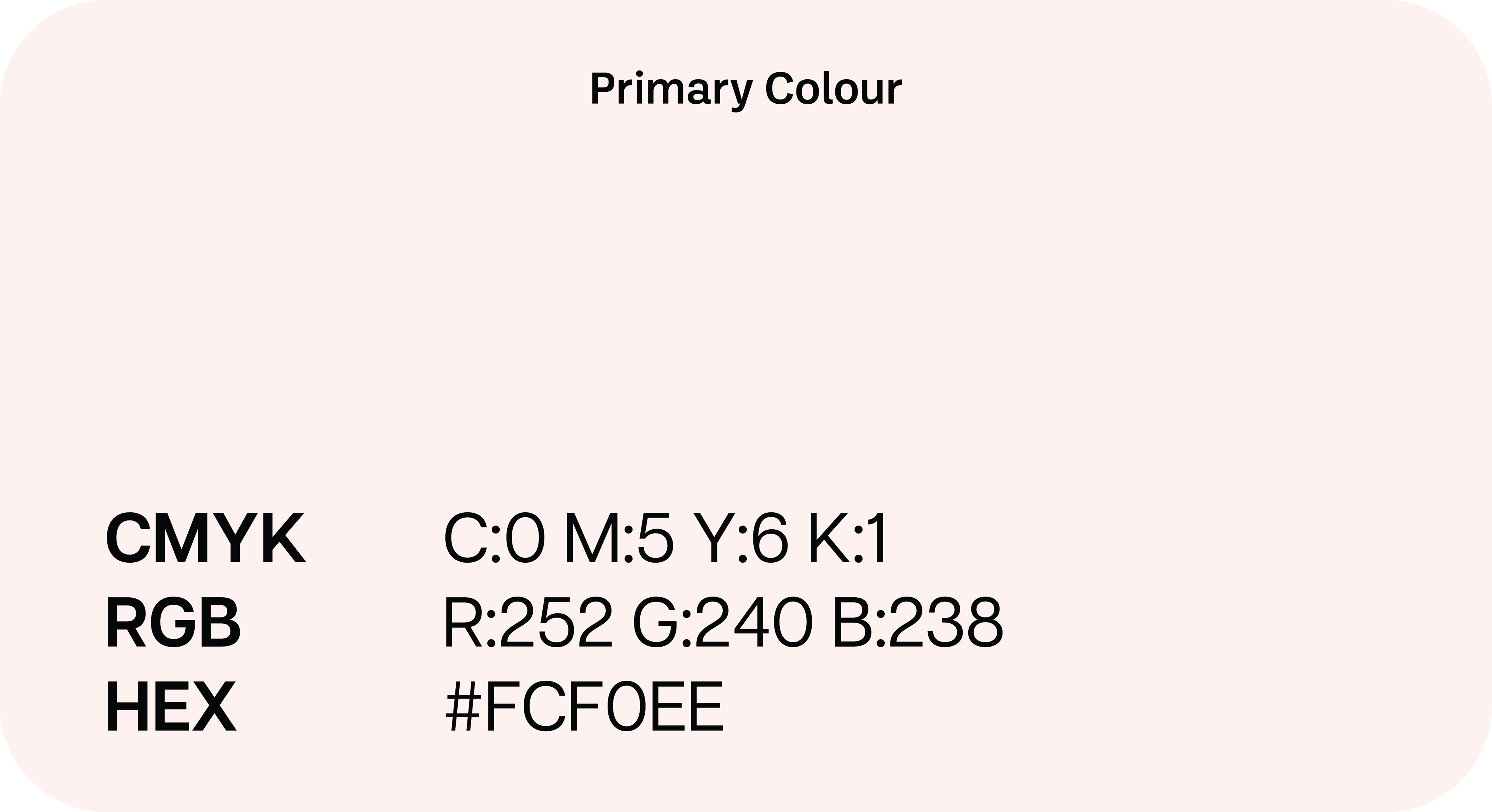
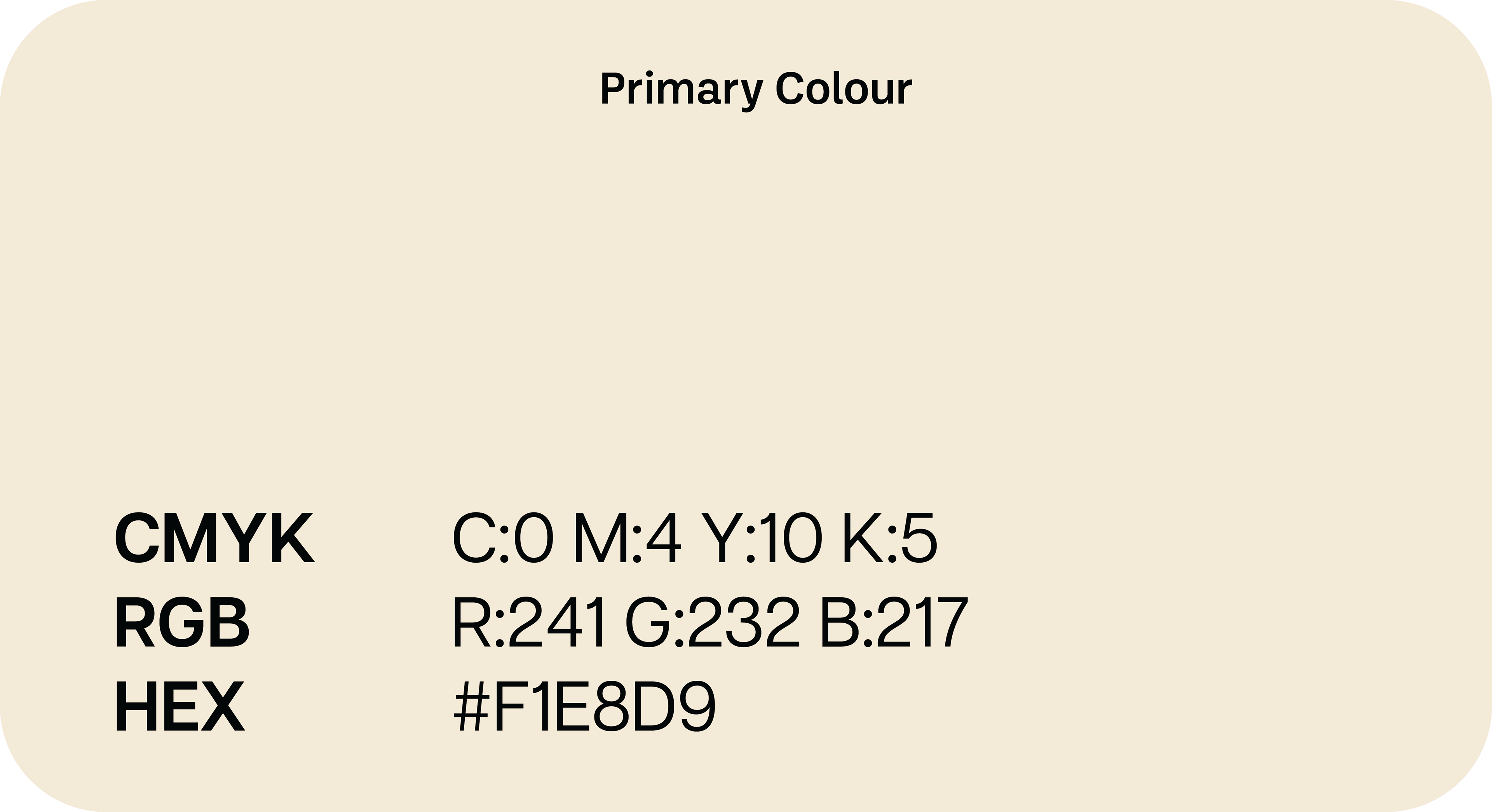
Background / Accent Colours: To create a welcoming digital space, Floral White and Bone are used as background and accent colours, adding warmth and a sense of calm to the overall design.
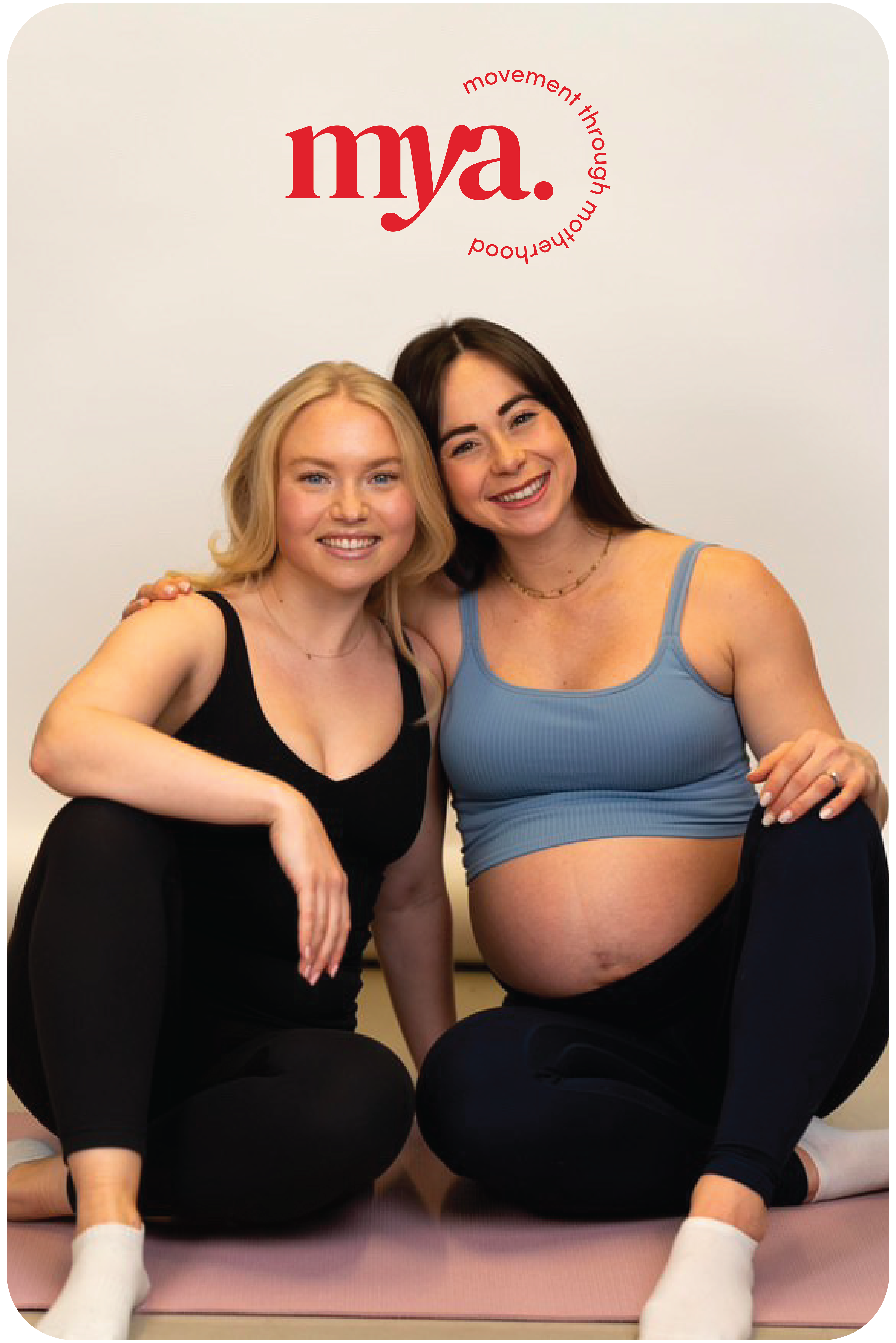
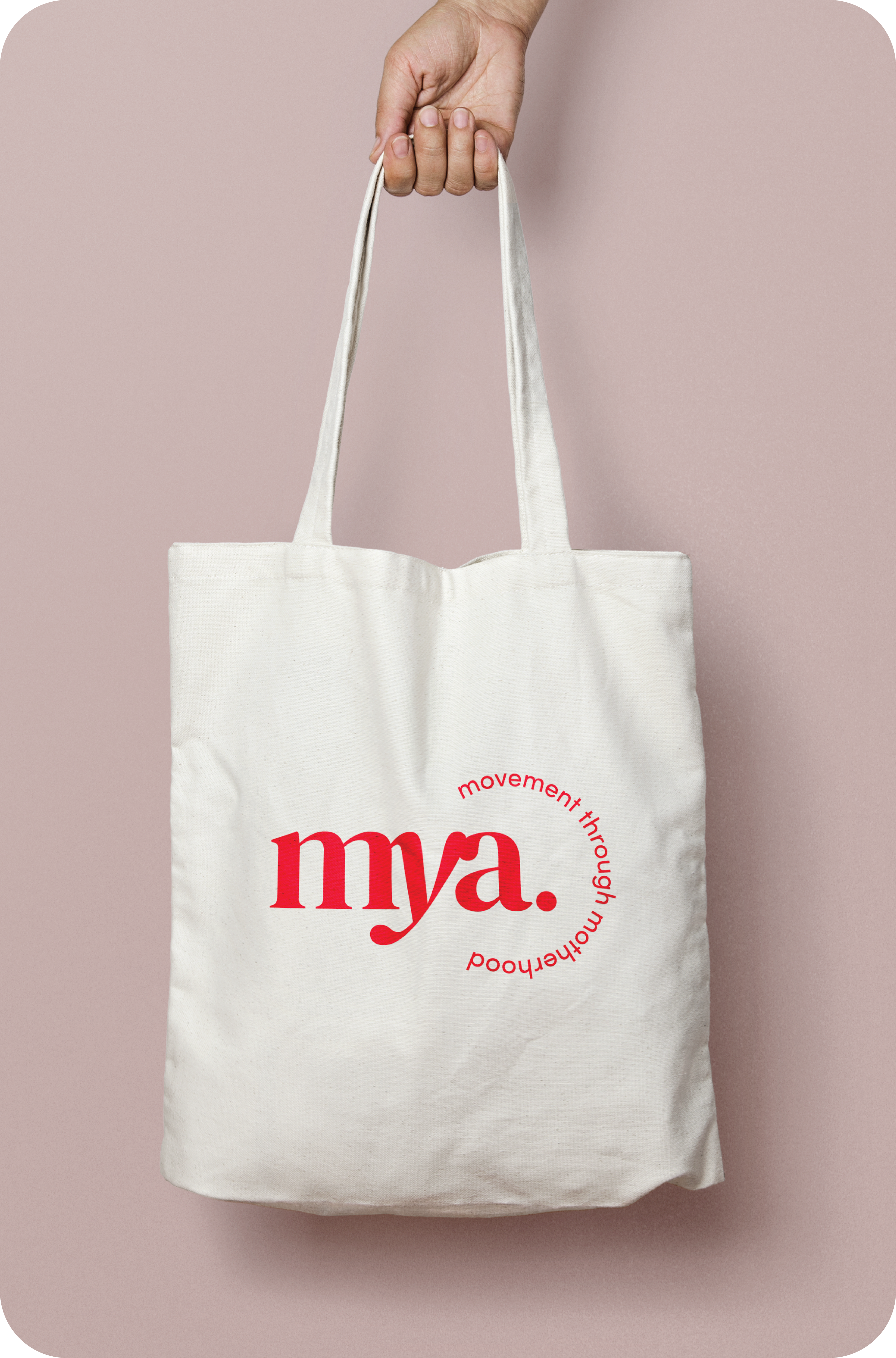
THE BRAND IN USE
CLIENT TESTIMONIAL
"Harry created something better than we could ever imagine! We are absolutely thrilled with the brand he has helped to create- it’s professional, fun and everything we could have hoped for! Absolutely we would hire him again!"
Sarah & Tori, Founders
Let's get started on your vision together!