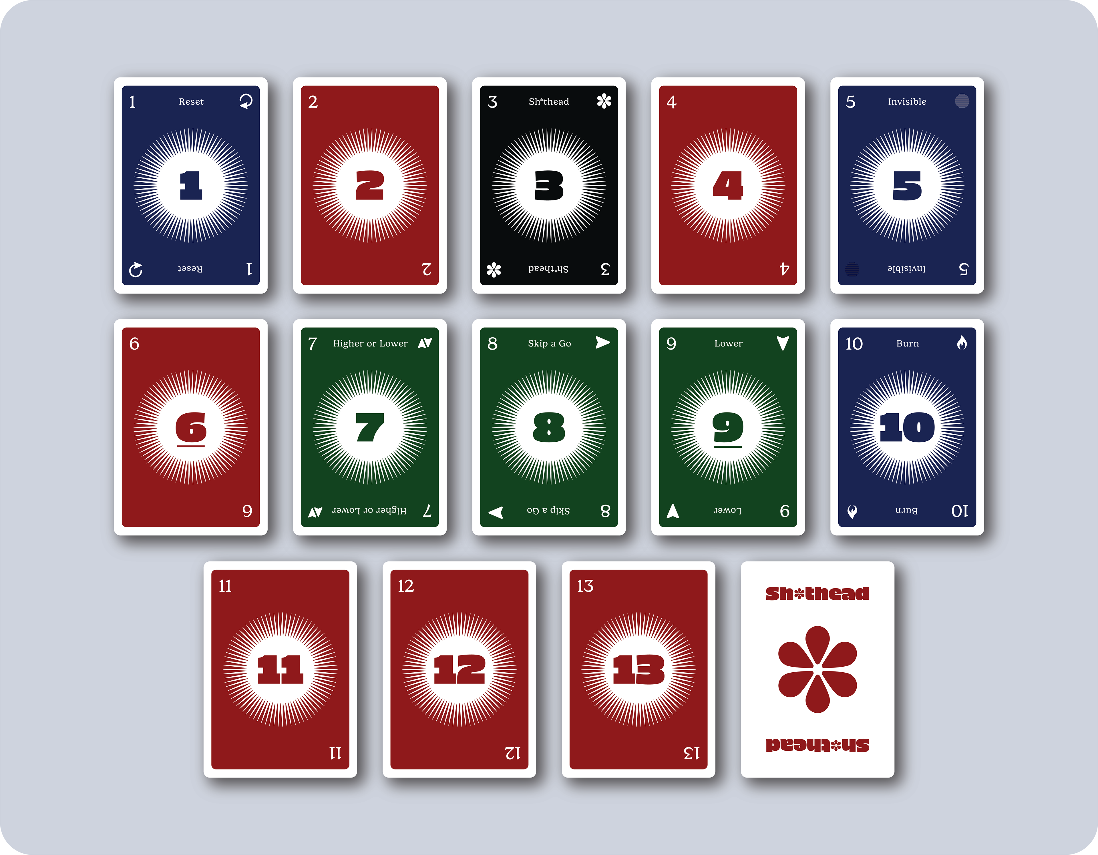
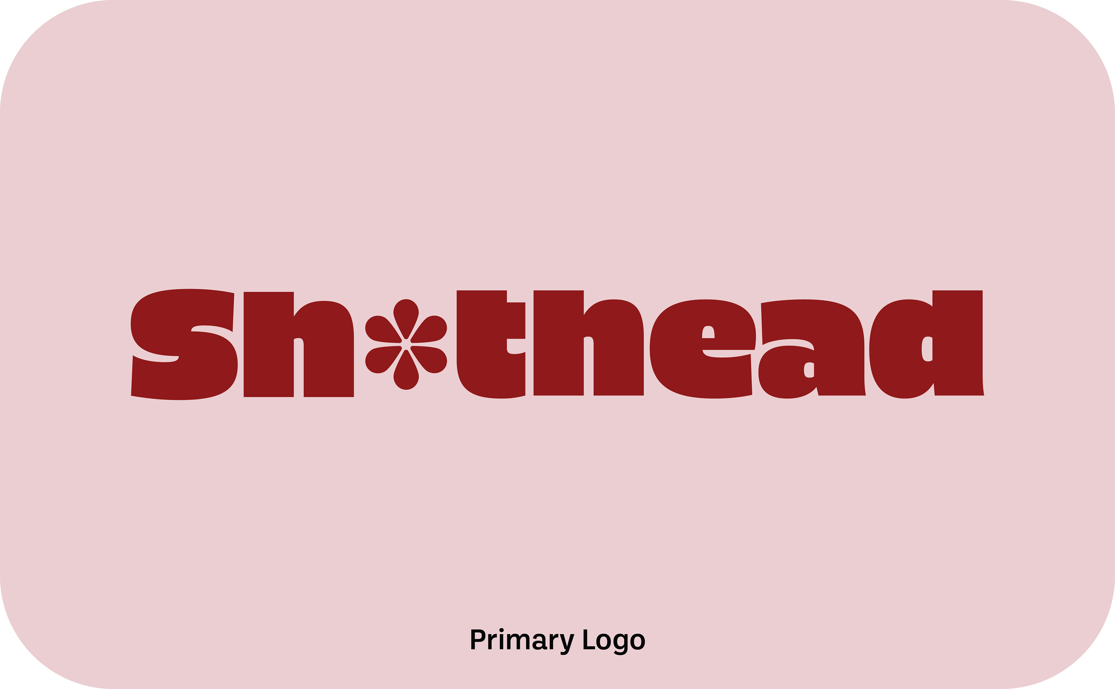
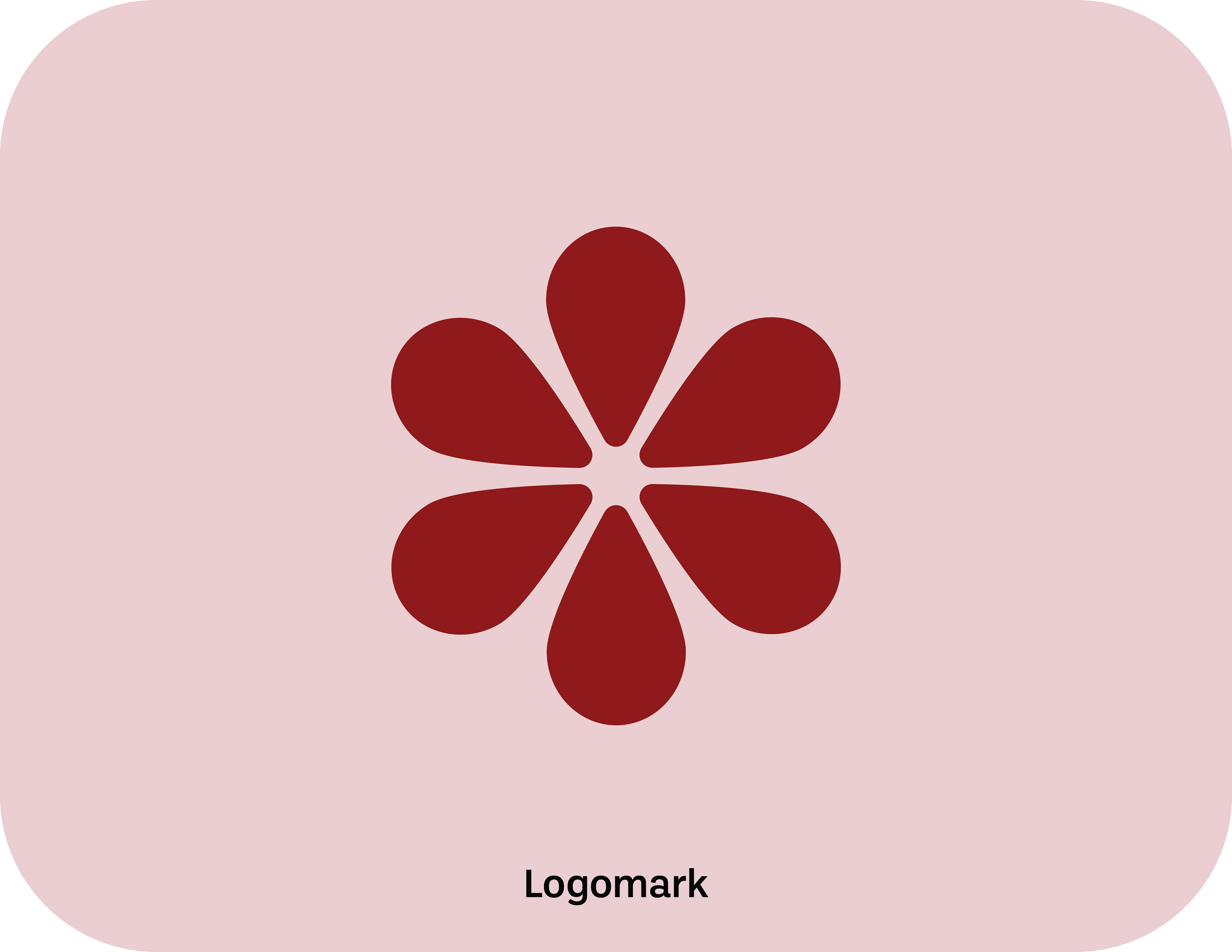
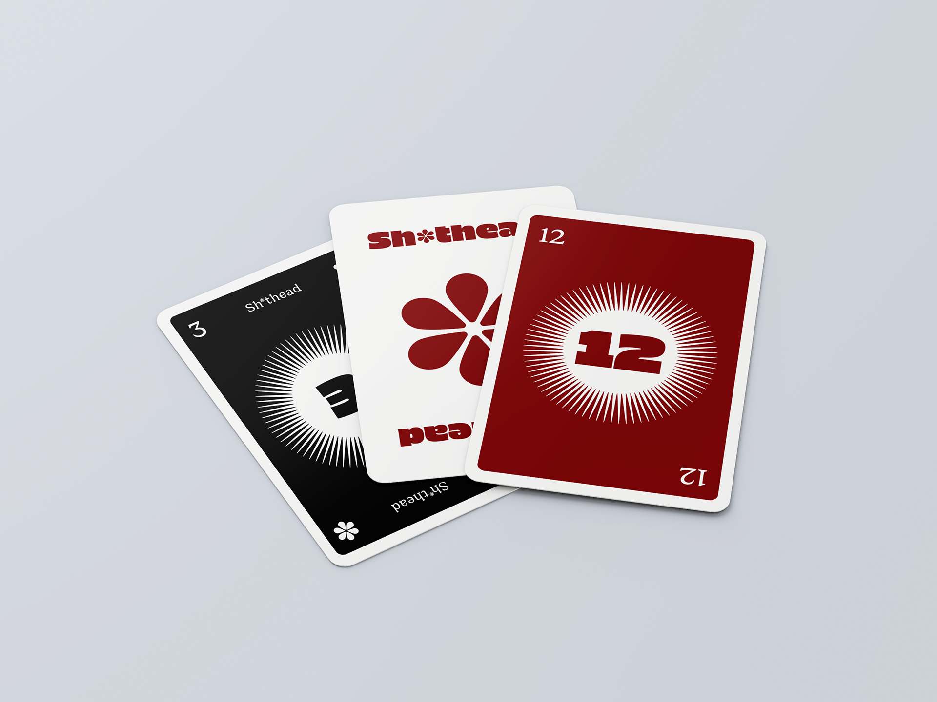
THE LOGO
The logo needed to be timeless and a bit fun, so I kept it PG by using a custom asterisk to censor the swearword. This asterisk design is also utilised as the unique standout logo mark for the brand.
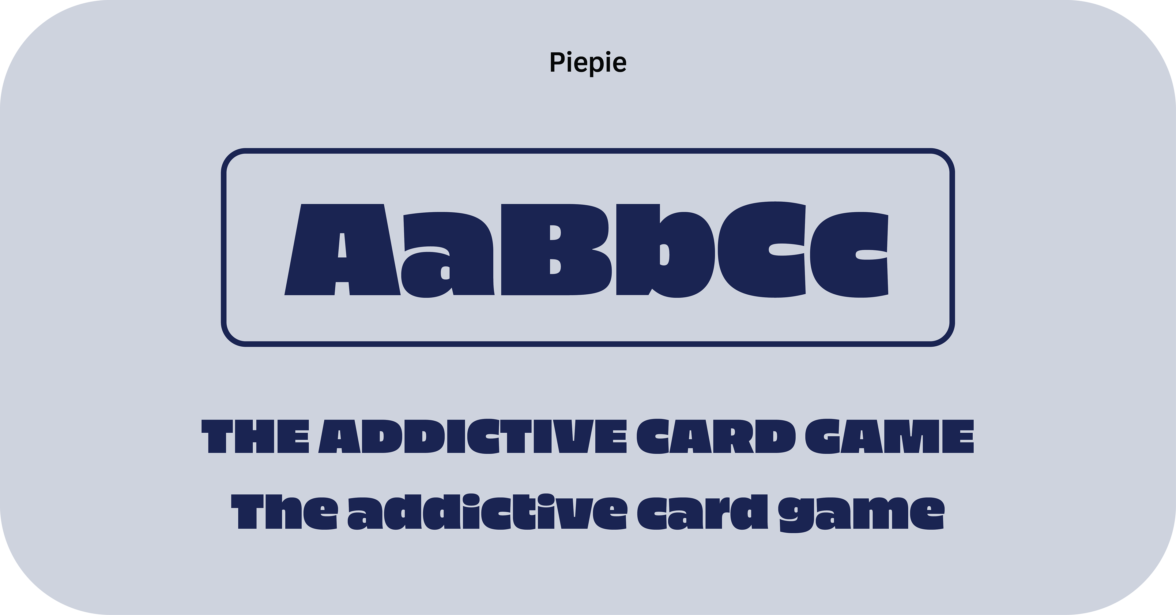
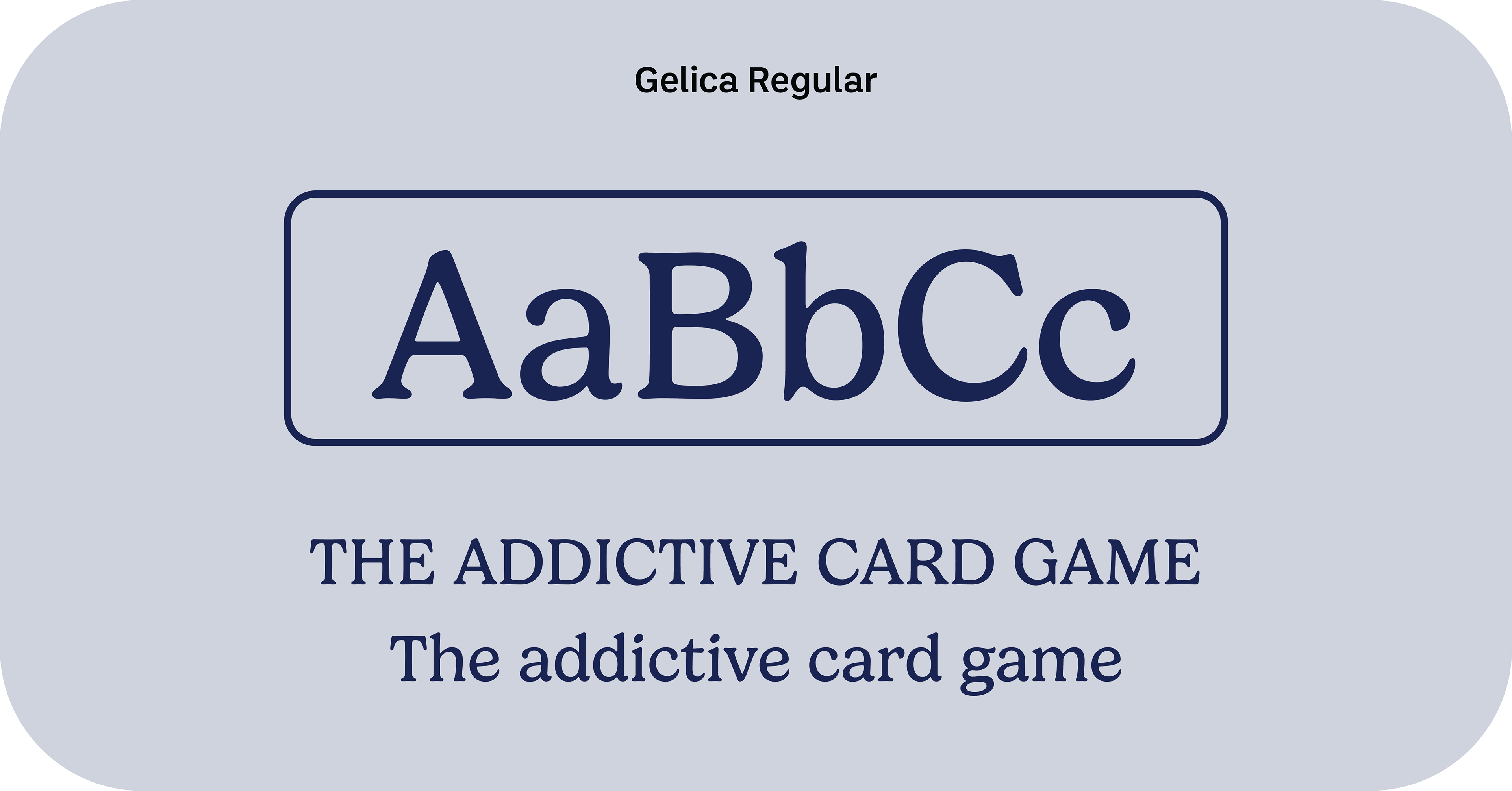
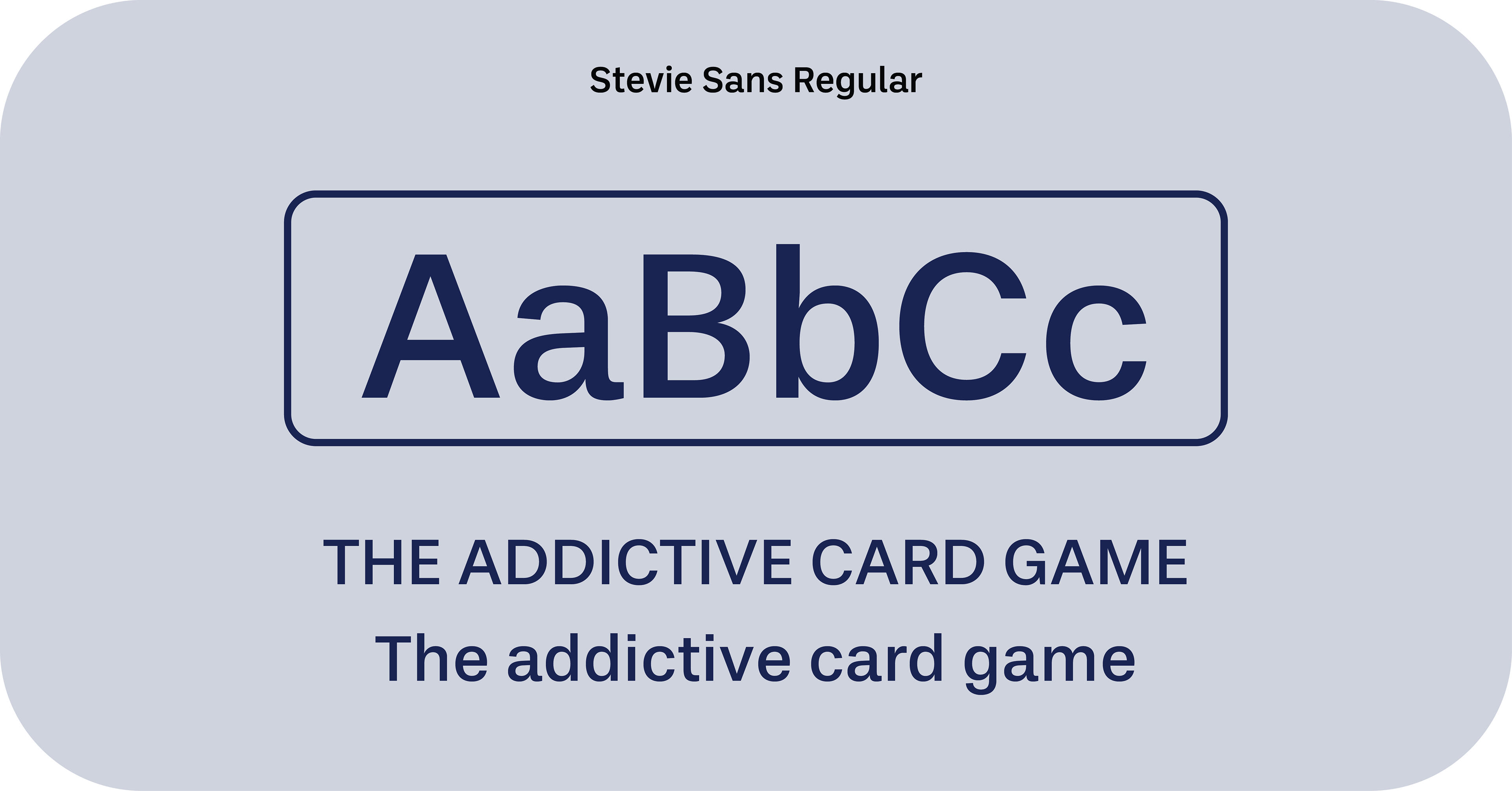
THE TYPOGRAPHY
As the primary font I decided to use OPTIStaines-Extended for fun and stylish brand image. This is paired with the serif font Argent CF which denotes a more traditional style of a deck of cards. This perfectly represents the brand as a fun and modern twist on a traditional deck of cards.
THE ICONOGRAPHY
These are the custom icons I designed to represent each of the magic cards within the card game. I wanted these icons to clearly represent the meaning of the card so a player can quickly glance without having to read and easily learn the game.

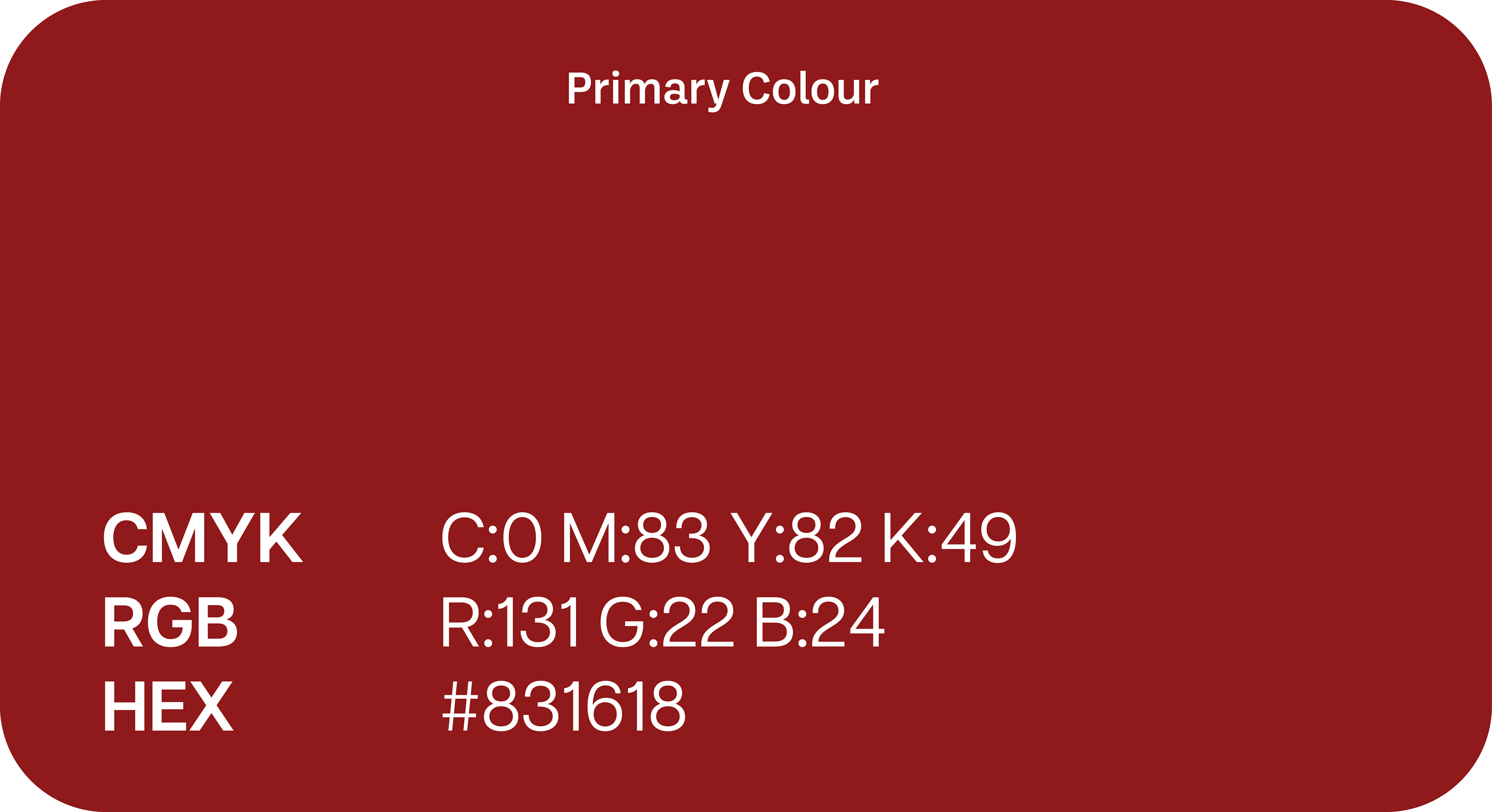
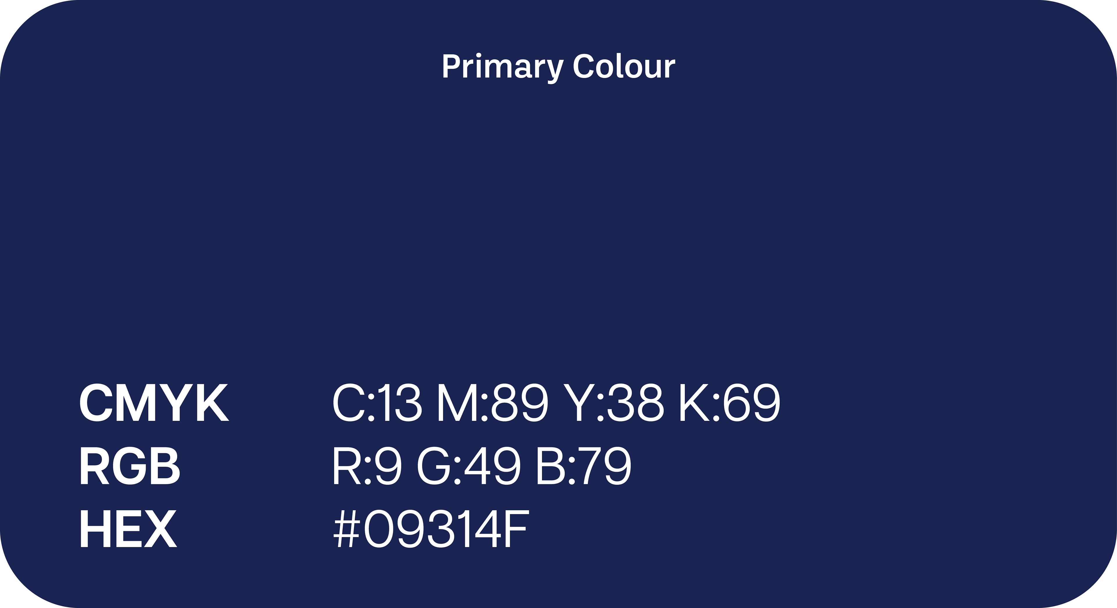
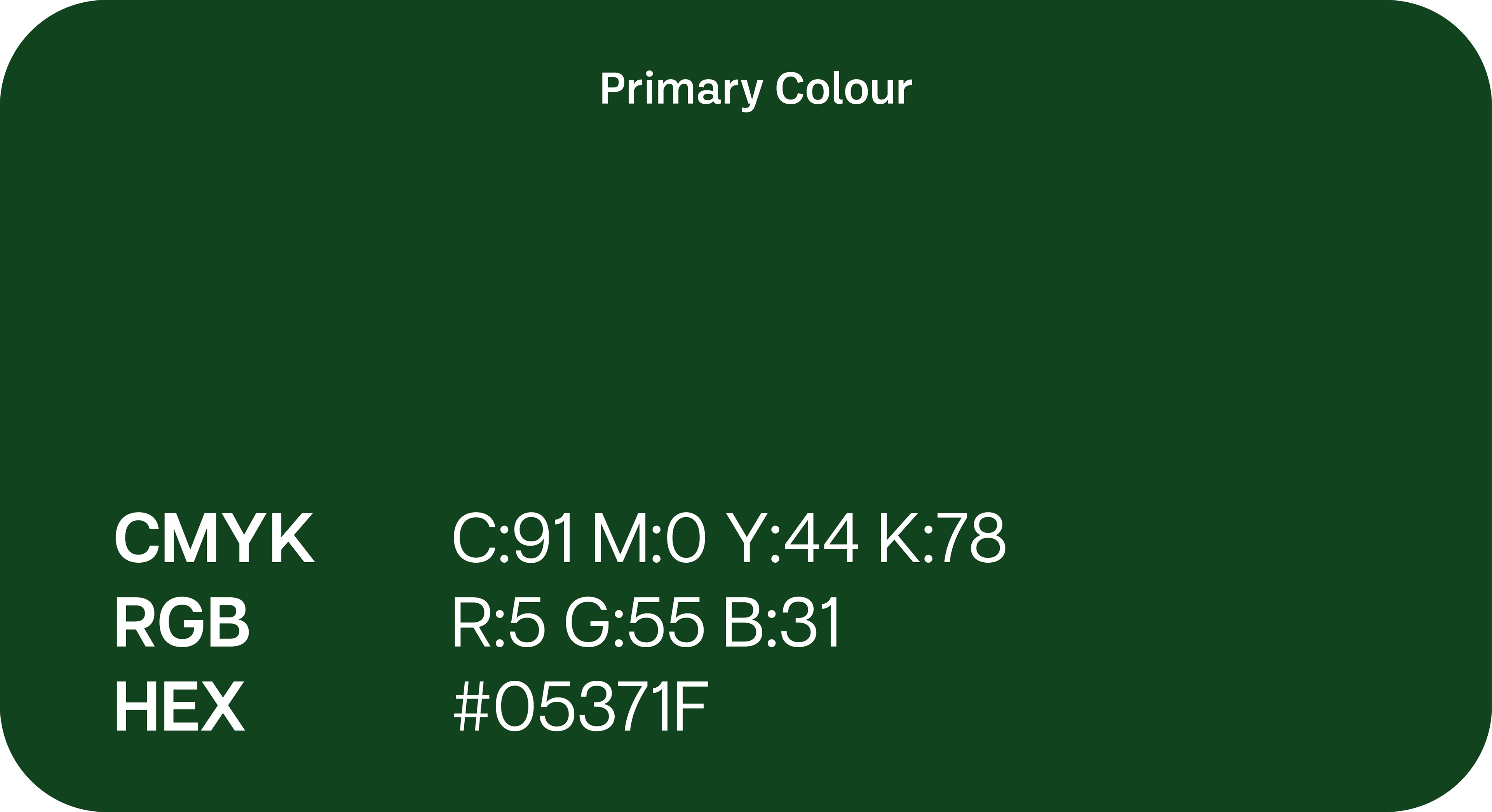
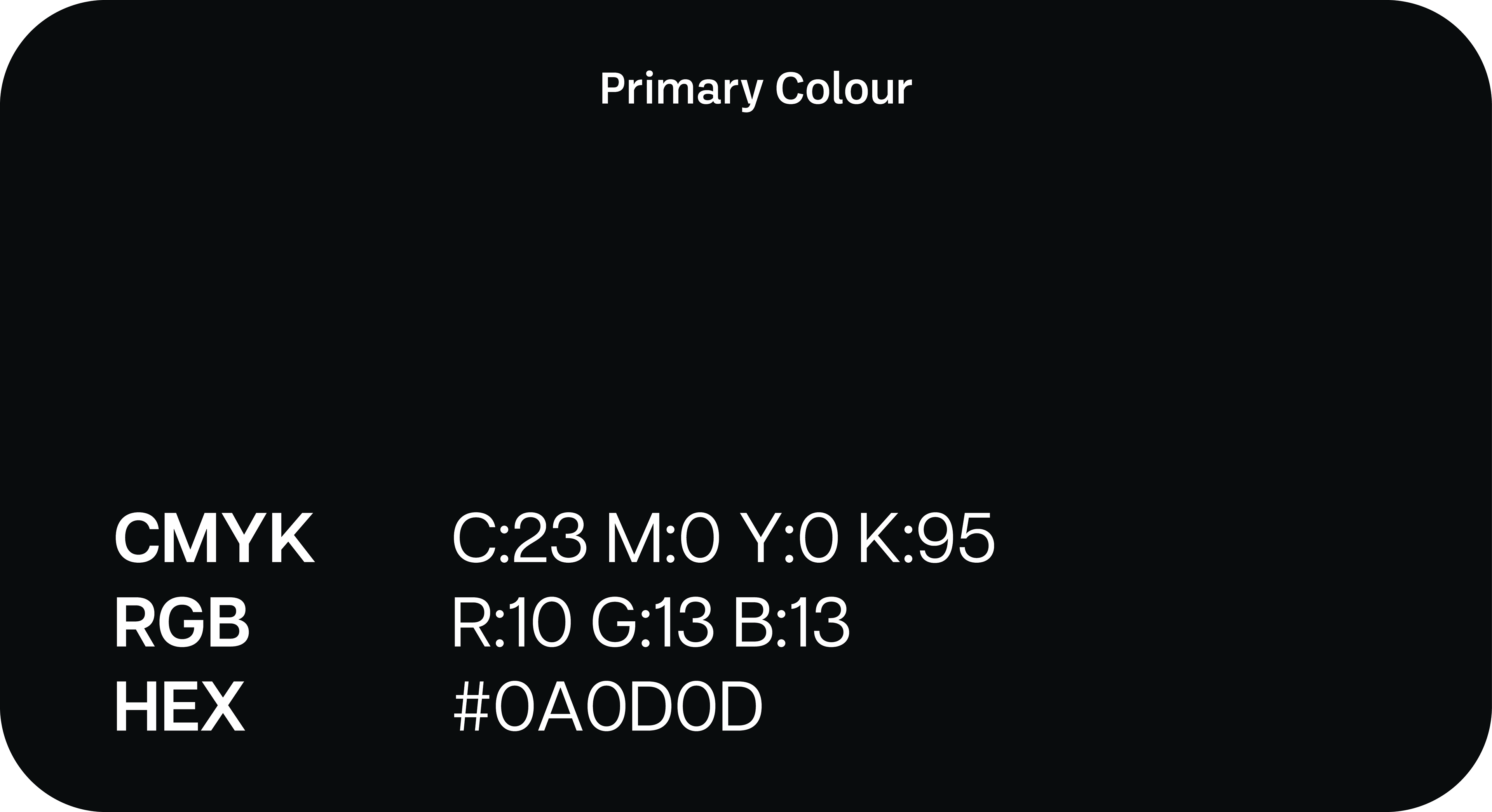
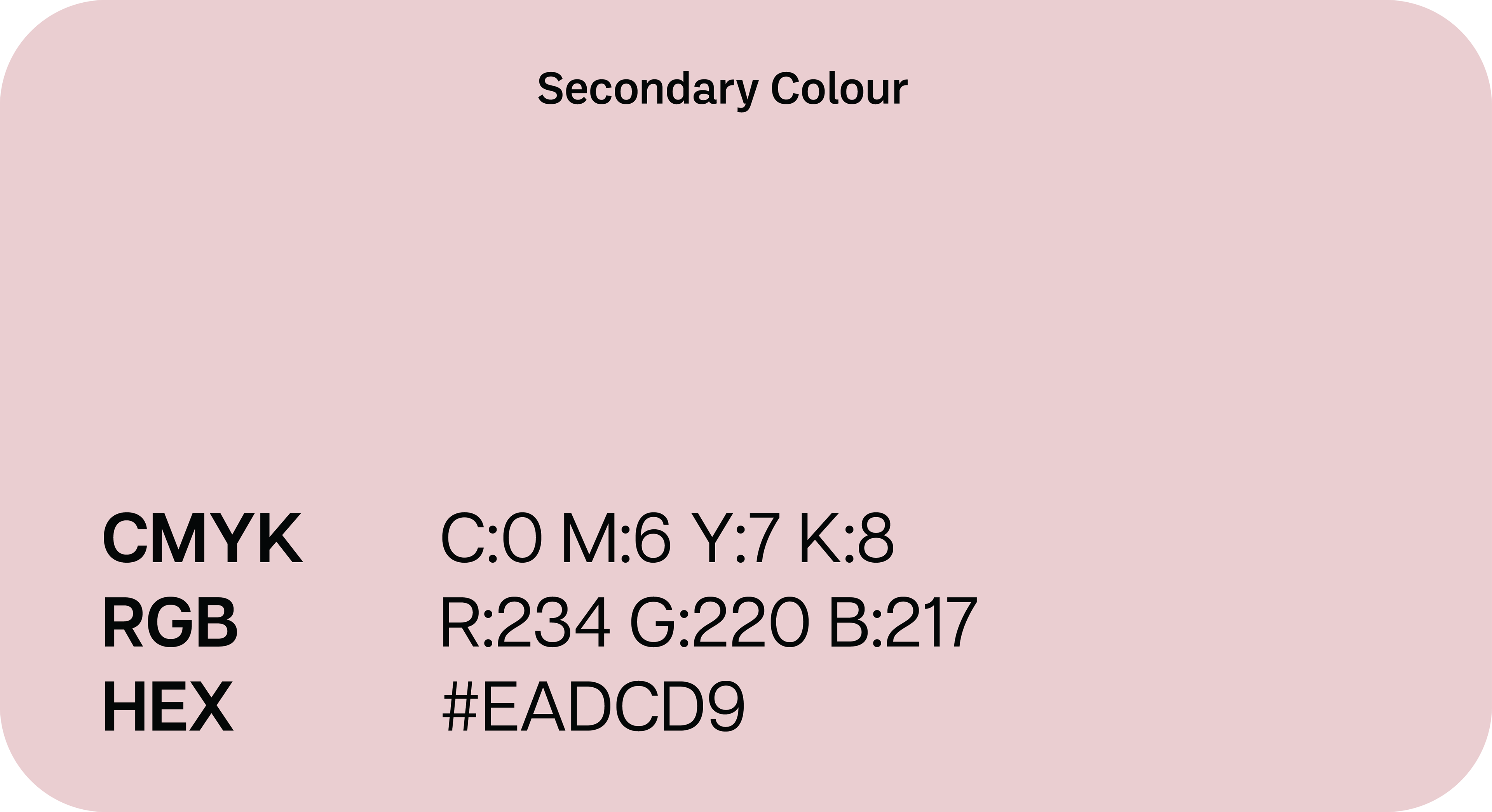
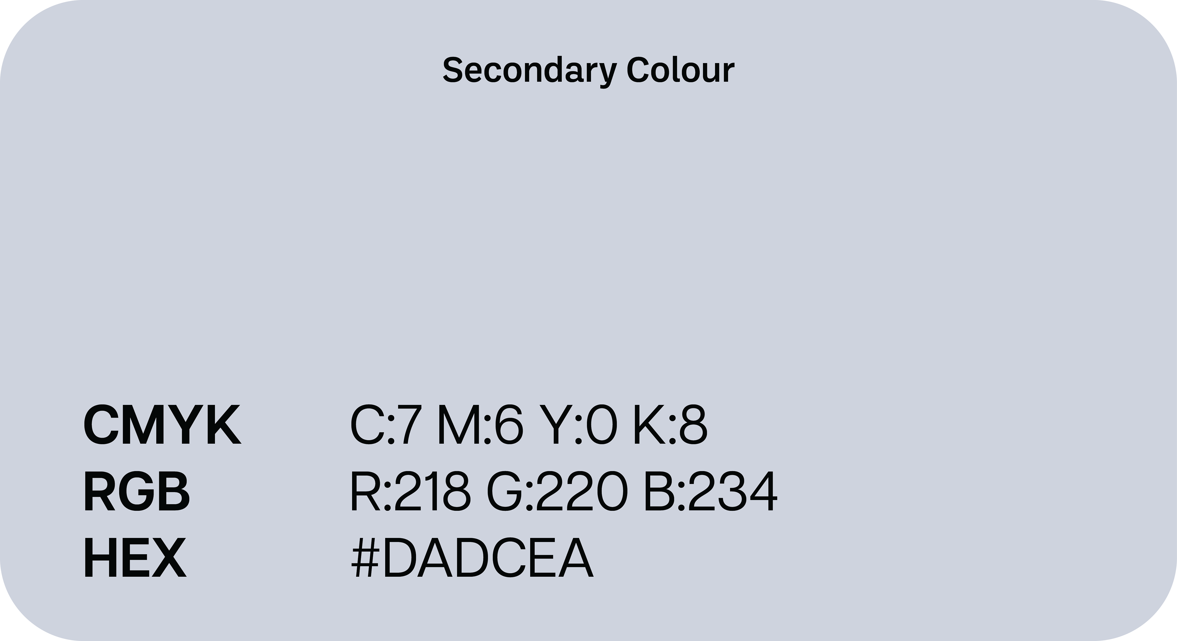
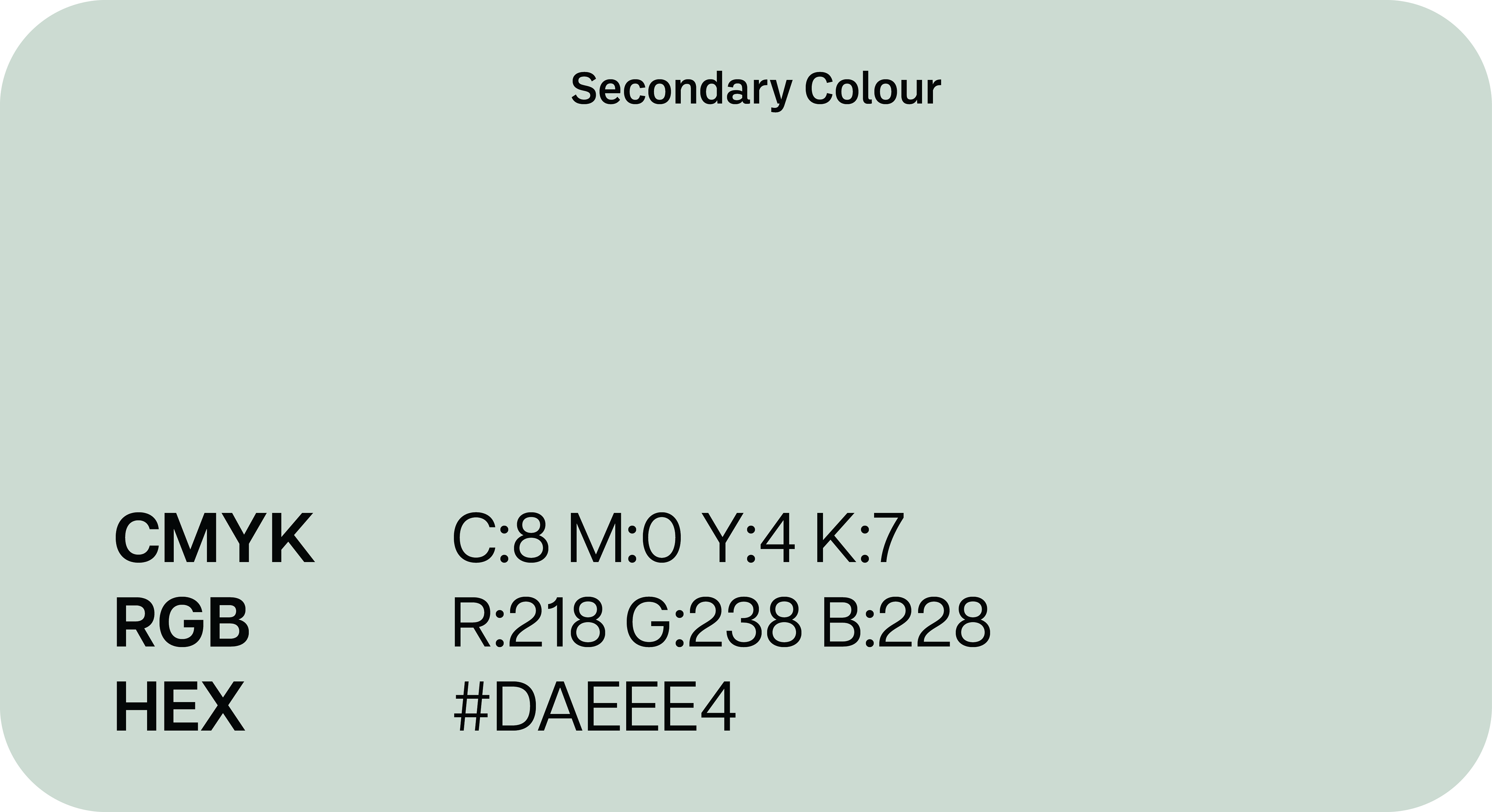
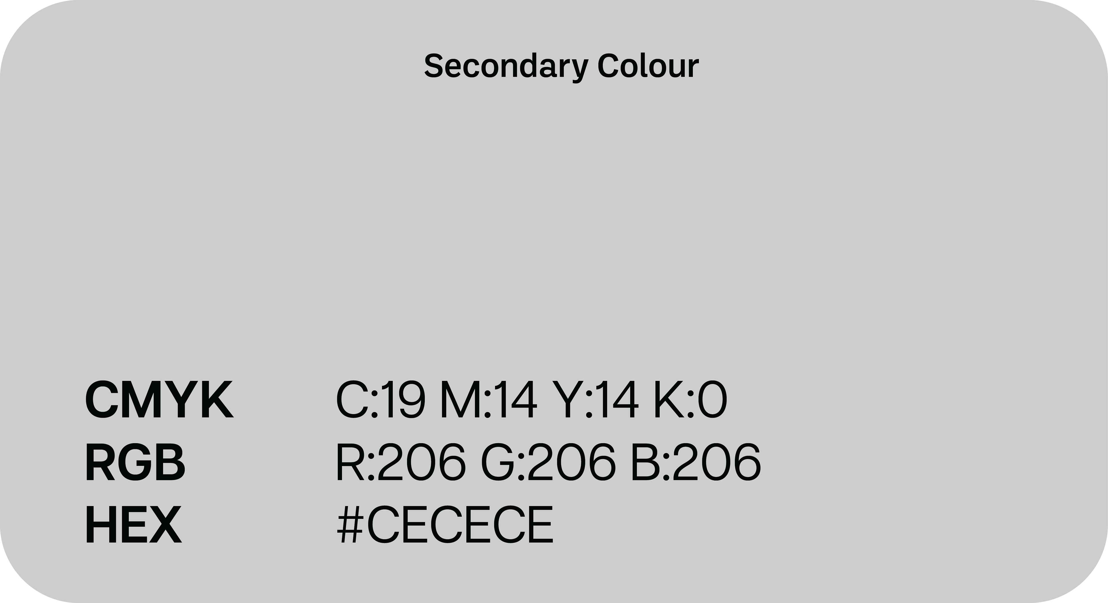
THE COLOUR PALETTE
I decided to go for a mix of deep toned red, blue and green to closely link the cards to a traditional deck of cards. These are paired with more pastel secondary colours for use in marketing materials.
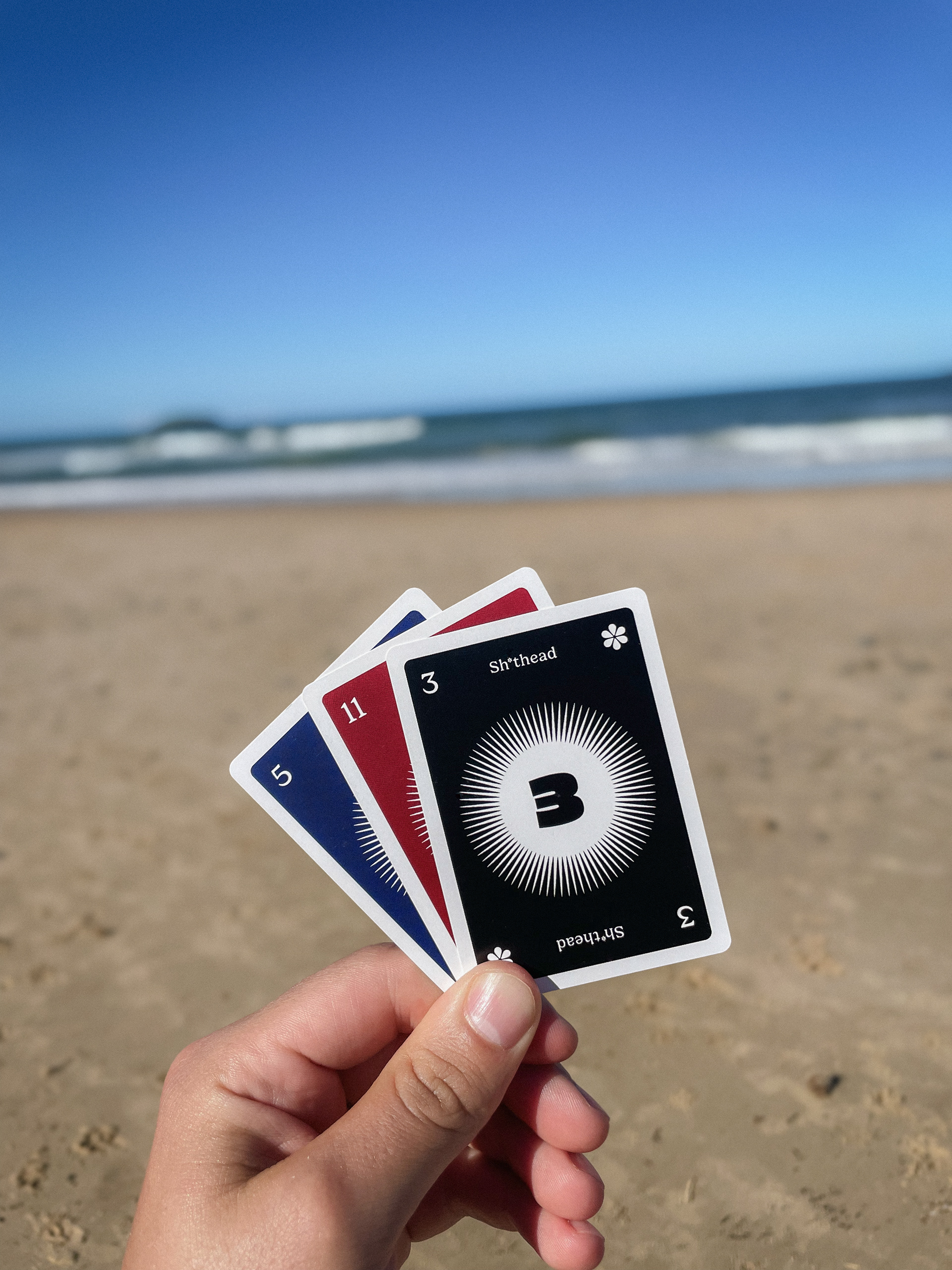
THE BRAND IN USE

Let's get started on your vision together!